


Every country’s world map has lines drawn differently from the next. But that’s just international politics.
Now imagine these lines redrawn according to the size of the country’s population. That’s exactly what Redditor TeaDranks did.
And things don’t look too good for India, for obvious child production reasons.
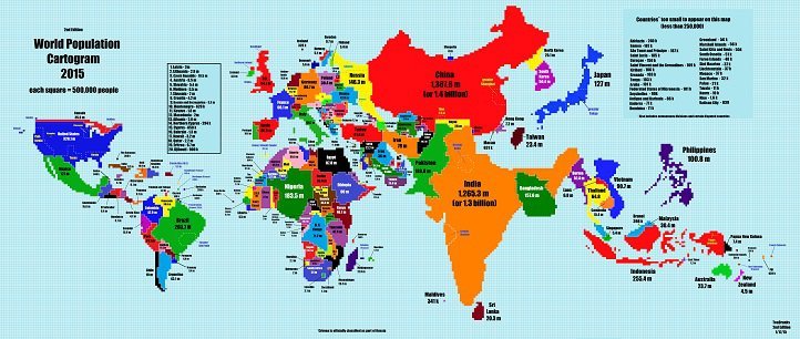
Look closely. India almost eclipses Xi’s China here. Modi ji, please ask Sakshi Maharaj and others who want more Hindu children to rethink their plans.
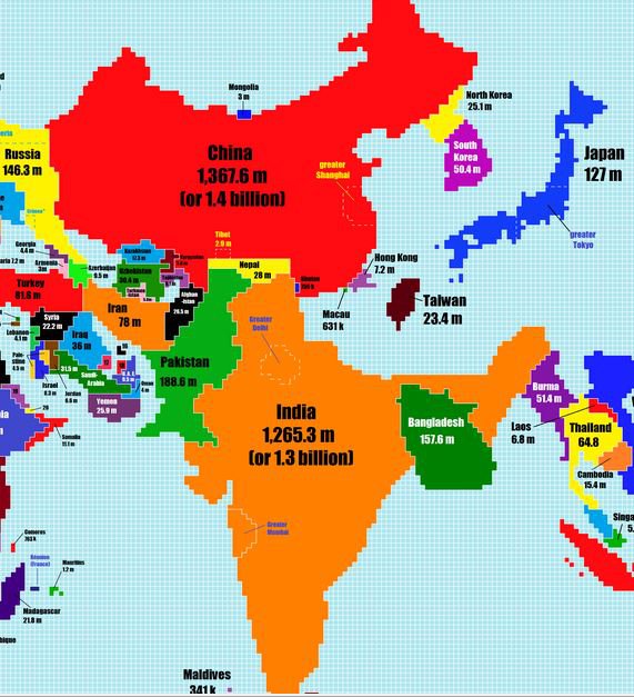
The map lacks accuracy thanks to stretching along pixels to maintain existing boundaries. Which explains why Nepal sits on India’s head. But it obviously doesn’t explain why Nepal and Pakistan share a border now. Oh well.
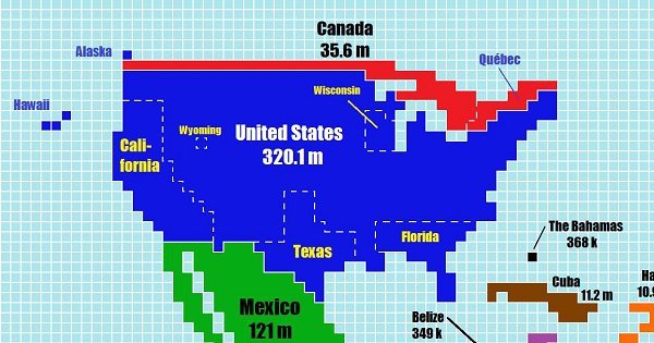
Another interesting thing we observed is how some otherwise massive countries are so tiny that they appear to be mere smudges along borders. Example: Canada.
“TeaDranks posted the graphic on Reddit’s ‘map porn’ discussion on Jan 16,” NPR reports. “He calls it his ‘magnum opus’.” Well, we agree.
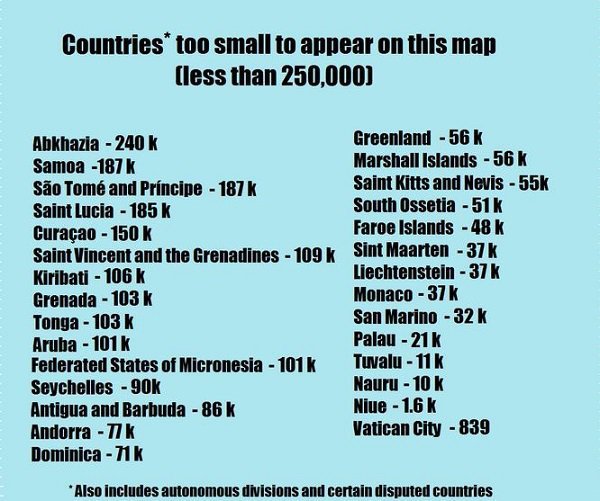
Also, did you wonder where that large, cold country Greenland went? In here.
Well, size does matter after all, eh?
(You can zoom in and zoom out of the full map here . You’re welcome.)
Top picks for you


