The original Rolling Stones logo, apart from being one of the world’s most instantly recognisable symbols of rock ‘n’ roll, perfectly captures the band’s rebel attitude in pushing sexual and social norms. Even their lyrics and off-stage antics were intended to push the boundaries of what was deemed ‘socially acceptable’.
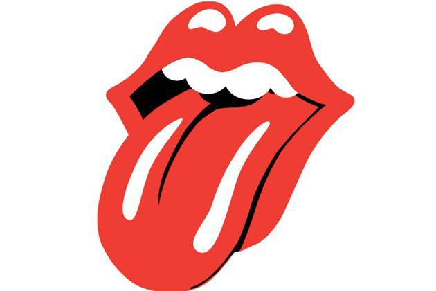
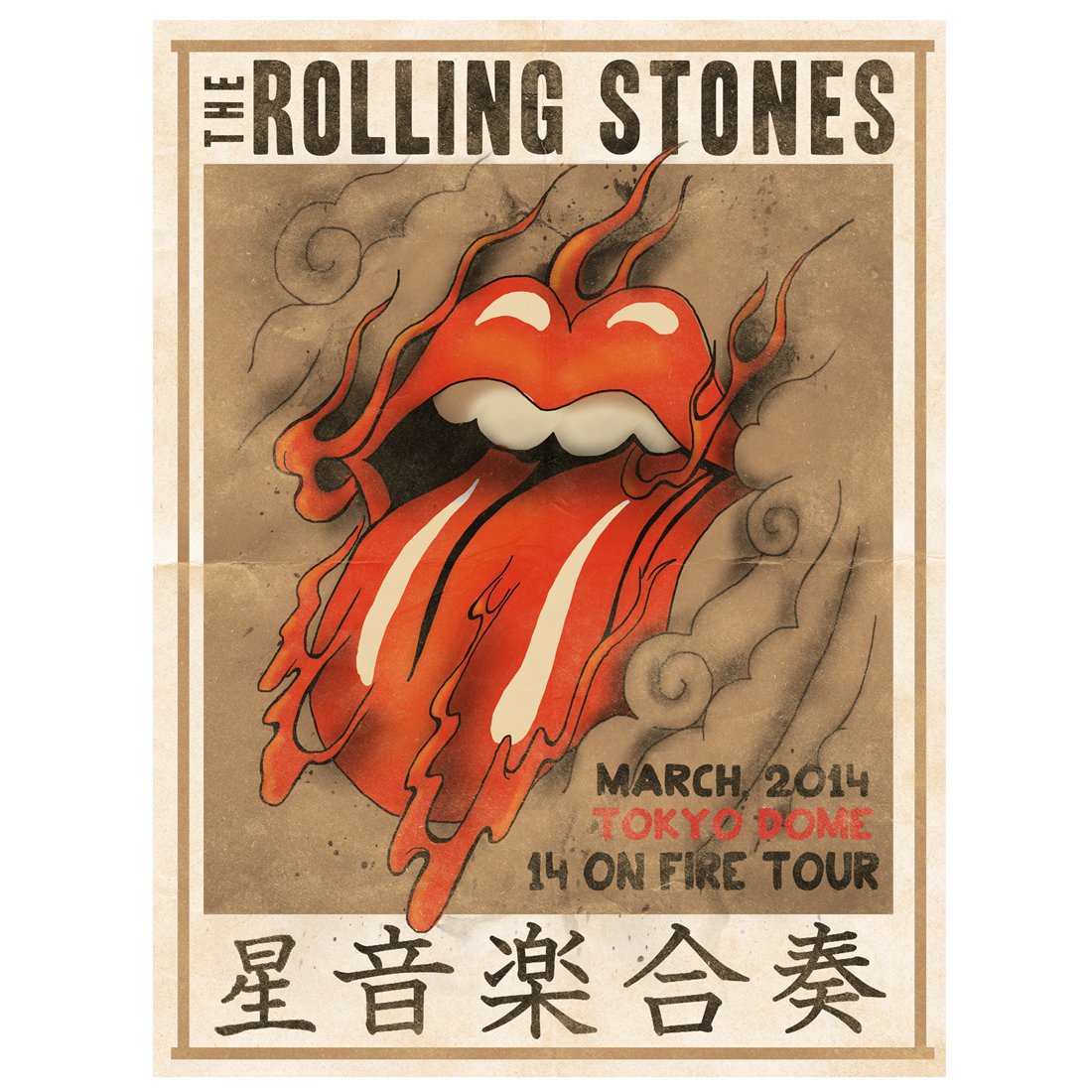
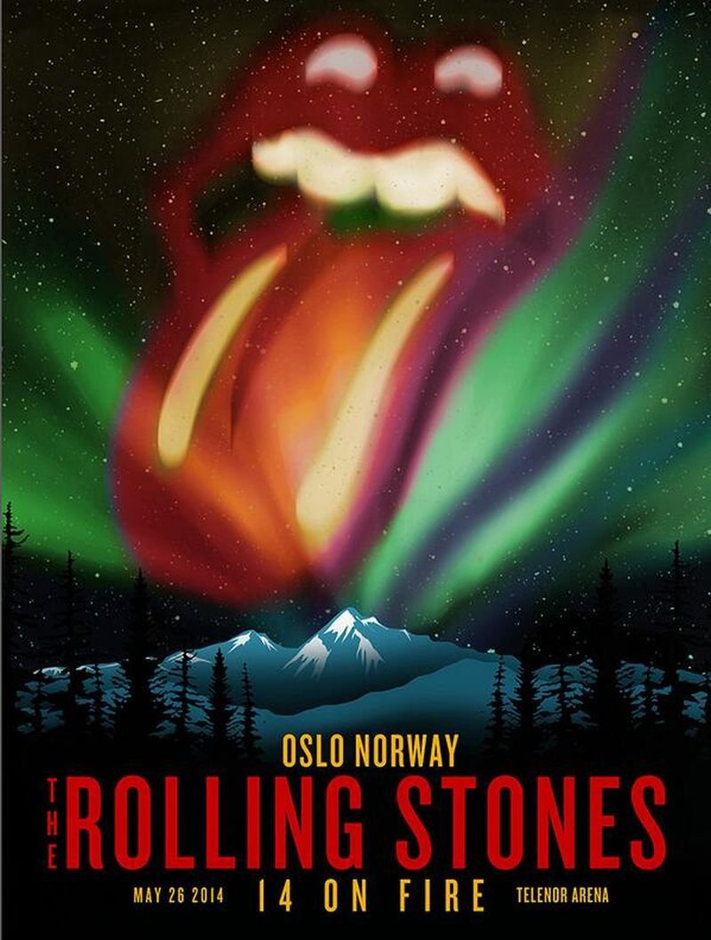
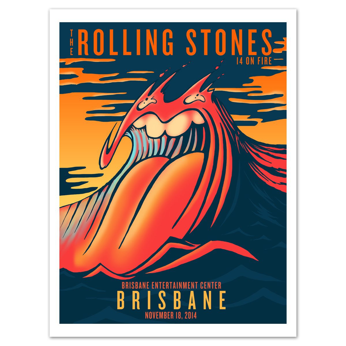
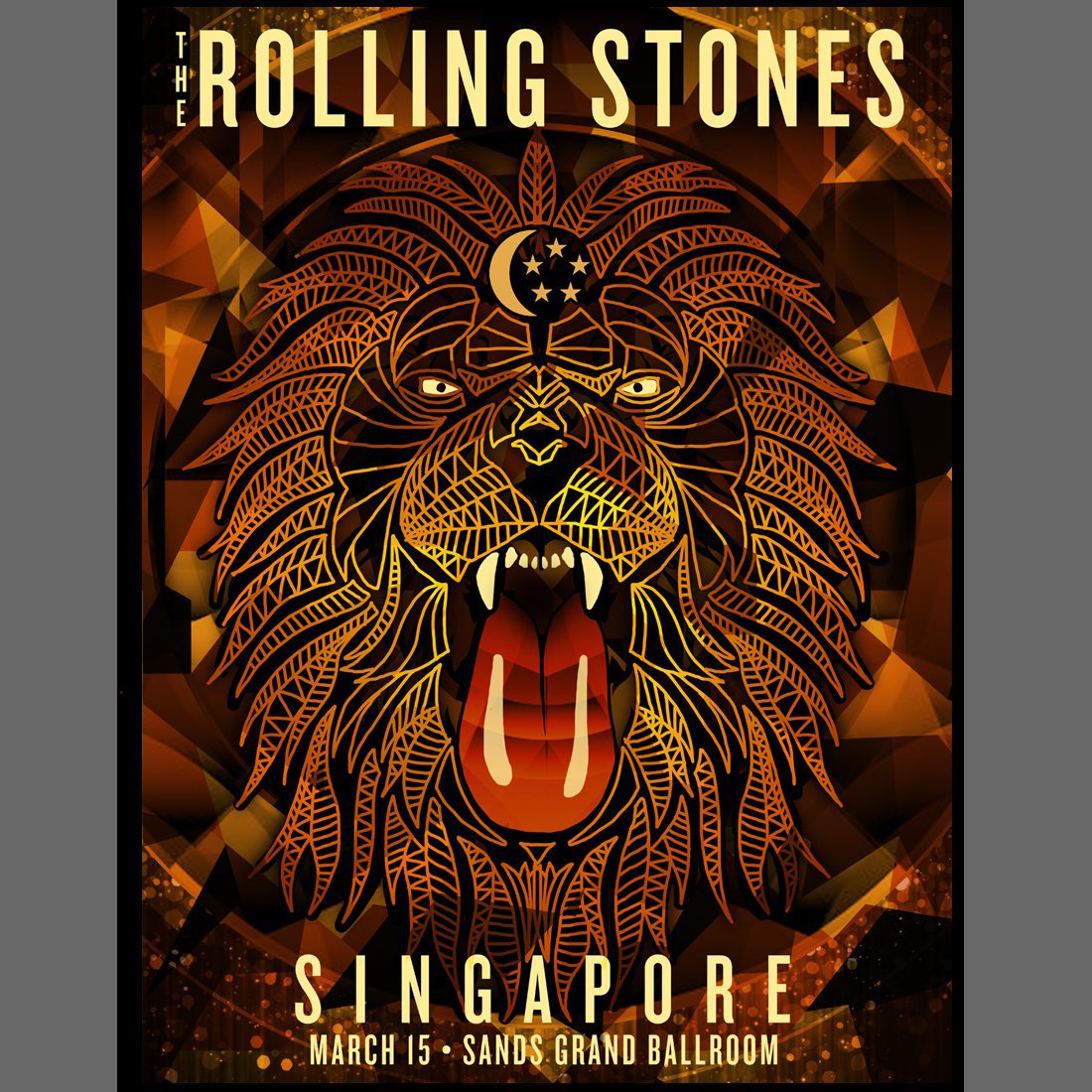
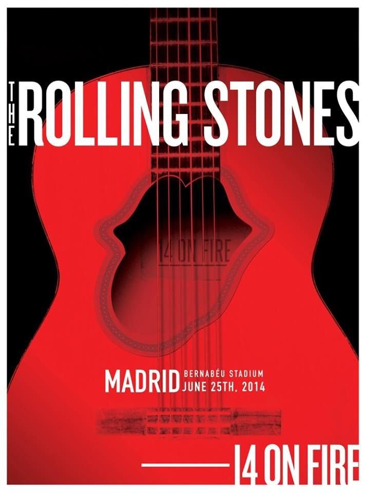
Since the creation of the logo, it has been a prominent feature of the band and their identity. Appearing on posters, t-shirts, concerts, it must without reasonable doubt be one of the most universally recognisable logos is in rock or even branding history. They even adapt the logos and customise it for the country they are going to play, almost like a hat tip from the band to their fans.
Here is a poster of their show in Tokyo.
And another from their show in Norway.
And a fierce lion sporting their logo beckoning their fans in Singapore
Even Madrid got some hot love
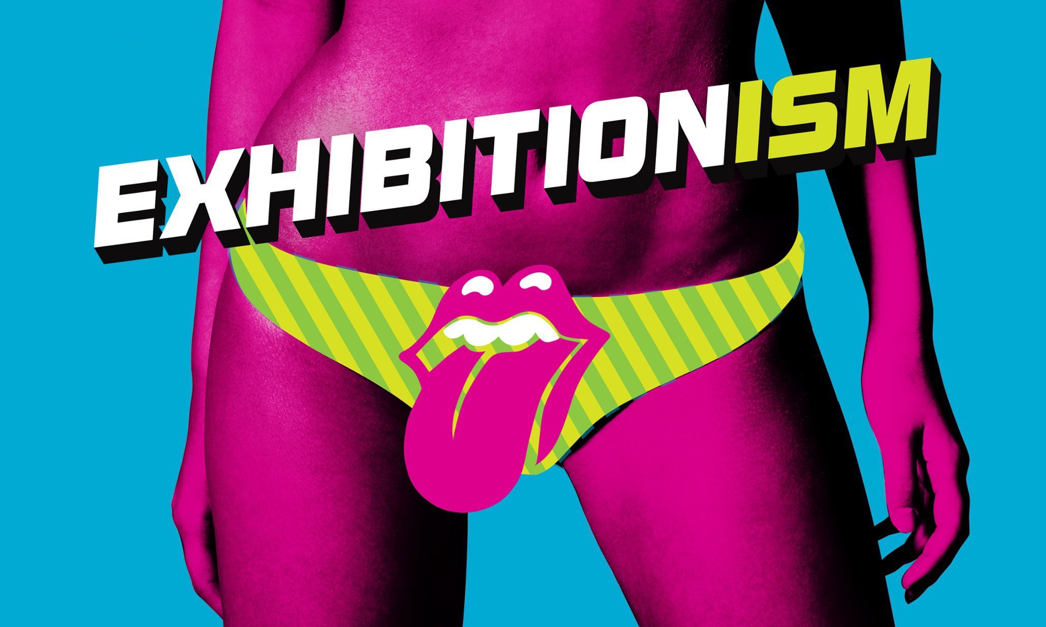
And this controversial poster that got them in trouble with the London Underground – that asked for the band logo to be shifted from the crotch to the belly-button.
Most fans must have followed the whole discography without ever understanding where that logo came from.
The original name of the logo is “Tongue and Lips”, which some have shortened to “Hot Lips.” In an interview with Adweek, Mash Bonigala, who runs an image consulting firm Spellbrand said, “It’s really the most evocative logo of any band. By distilling the essence of the band into one single visual reference, the designer was able to create a logo that worked superbly well for 50 years.”
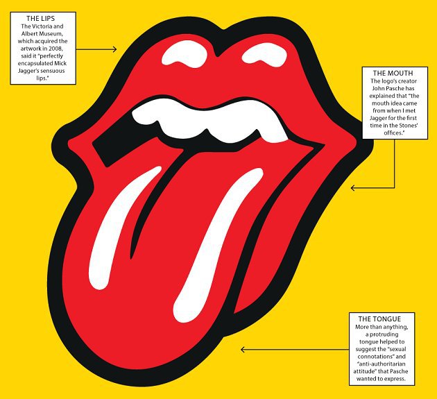
Mick Jagger, the lead vocalist of RS, called on London’s Royal College of Art in search of a student who could create some visually dynamic and innovative logo for the band’s next album. He liked John Pasche’s work, who accepted £50 (yes, £50 ONLY) for drawing the logo.
Mick Jagger wanted something that depicted never-ending energy, something on the lines of the Hindu Goddess Kali – who has her tongue sticking out of the mouth. The logo is also known to be based around Mick’s big mouth. Pasche said he found greater inspiration in Jagger himself.
“I went into this sort of wood-paneled boardroom and there he was,” Pasche said. “Face-to-face with him, the first thing you were aware of was the size of his lips and mouth.”
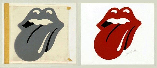
Tongue-and-Lips was first used on the RS Sticky Fingers album and has been a constant feature of every album released post the 1970s.