There’s so much talk on the Internet about Apple that it might seems like there’s nothing more to find out. But interestingly enough you might have missed the original prototype that the company designed as its logo. The artwork, in fact, depicts one of the most famous anecdotes out of science history.
Here’s what the prototype design for Apple Inc looked like back in 1976.
Steve Jobs originally conceived the name for the company while visiting an apple farm.
Back in 1976, while on a fruitarian diet, Steve Jobs considered naming the then recently founded technology company, Apple Inc because it was “fun, spirited and not intimidating”. Which, obviously resonates with the logo that we all recognize so well – an apple with a bite taken out.
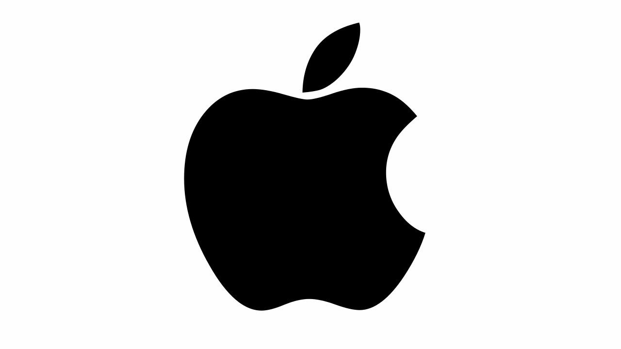
The logo was designed by Rob Janoff.
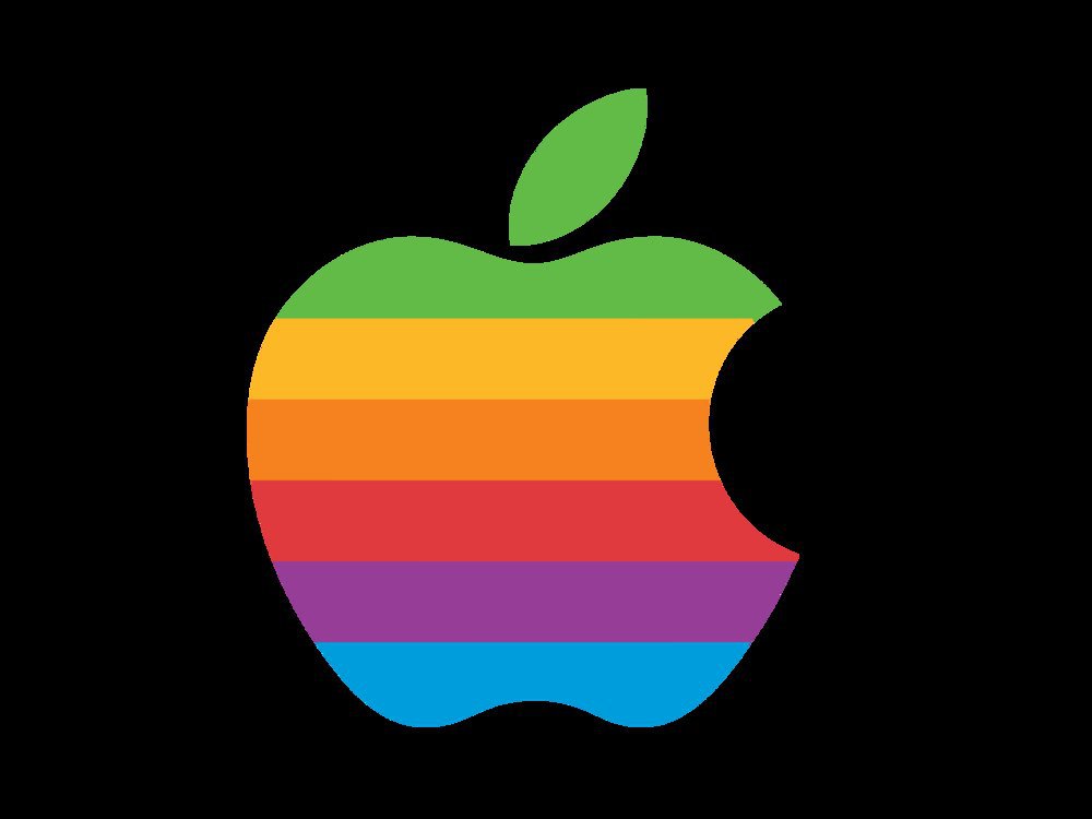
The silhouette of apple with a bite taken out of it, coloured with the rainbow. Now, you might not remember the one coloured with the rainbow, which was the official logo for the company between 1977 and 1998. Because, Apple began using the monochromatic version of this logo by August, 1999.
The first ever prototype, although, was designed by Ron Wayne.
Almost immediately replaced by its successor, back in 1976 the first prototype for Apple’s logo was designed by Ron Wayne depicting one of the scientific history’s most famous anecdotal settings. The original logo depicted Sir Isaac Newton sitting under an apple tree, with one fairly obvious apple sticking out.
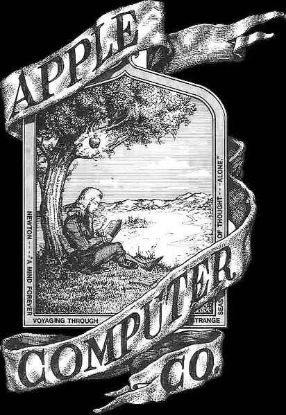
Now, tell us if that logo doesn’t look like a badass biker tattoo.
Masthead Source: wallpapercave.com, Feature Image Source: dailymail.co.uk