


When watching our favourite shows on TV, most of us usually just skip through the numerous ads that come in between. Little do we think about the hard work that goes into making a product, a brand. A product becomes a brand because of the promise that it makes to its consumers, edge over its competitors, and of course, its recall value.
But sometimes, a brand also needs to reinvent itself with changing times. And the efforts that companies put to execute this are commendable.
Here are some popular brands that reinvented themselves from time to time.
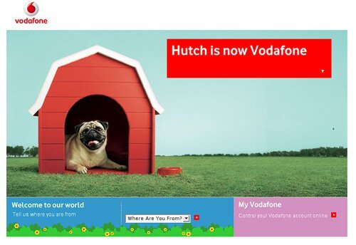
1. Hutch-Vodafone
Vodafone was greeted in India with Hutch Is Now Vodafone campaign in 2007 after it acquired Hutchinson. Vodafone went in for an overnight transformation of the brand by targeting all points of purchase. From customer care centres to sim card packets and sales executives, everything was turned into red, overnight! To advertise the same, they tied up with Star India by playing Hutch is now Vodafone ads during every commercial break on Star Plus for 24 hours. This ensured maximum recall among the audience.
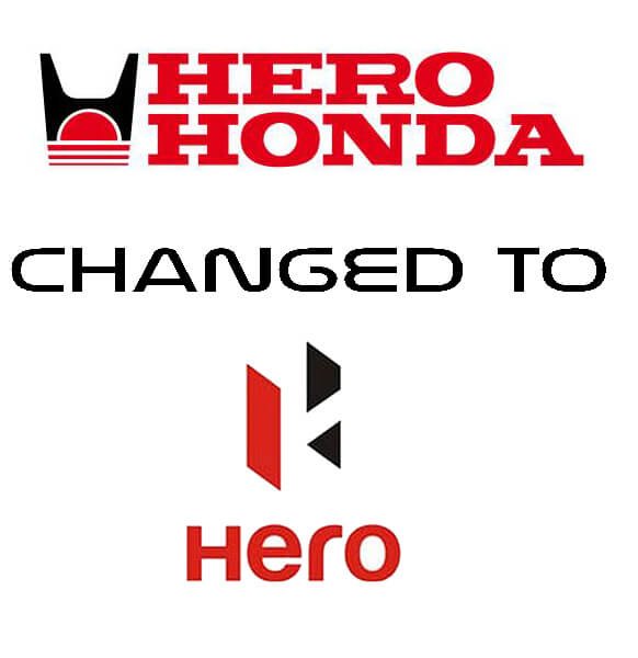
2. Hero Honda changed to Hero
Honda and Hero separated ways in 2011. Hero Moto Corp decided to go for a complete overhaul in the positioning with a change in their logo and slogan. They also roped in A.R. Rahman to compose the song for the ad, ‘Hum Mein Hai Hero’ which was launched on August 15, 2011. The black color in the new logo stands for solidity and premiumness while the Red gives a feeling of energy, passion, and confidence. The campaign was also followed digitally resulting in it going viral.
3. Dabur
Since its inception a couple of decades ago, Dabur has always been associated with the traditional portrayal of a woman. With an intention to break away from these stereotypes and take a stand for the modern woman, Dabur decided to enter the space of the digital world with long-format ad films on a woman’s fight with Cancer in the campaign, Brave and Beautiful. The 4-minute video got 3 million hits on the very first day and was a total hit.

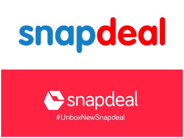
4. Snapdeal
In the six years of its existence, for the first time, Snapdeal went for a change in logo and its corporate identity in 2016 to manage its dropping sales position in the presence of Amazon and Flipkart. They tried to generate brand awareness through the new positioning and only recently, they’ve also come up with a new tagline, Unbox Zindagi. Their package boxes have been changed to red but they have an uncanny resemblance to Vodafone boxes, so we aren’t really sure if the transformation is going to strike the right chord.
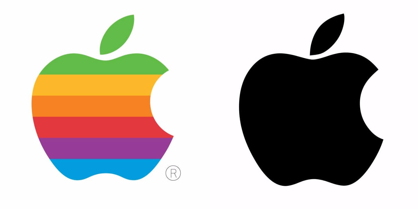
5. Apple
Apple decided to go simple while trying to change its existing positioning in 1998. They went for a fresh, clean, grey-coloured logo, moving away from the rainbow-coloured logo. These changes were made by Steve Jobs as soon as he became Apple’s CEO. He made immediate changes to the corporate identity with its Think Different Campaign in 1997. Apple created products and apps consistent to its personality which resulted in higher recognition among consumers.
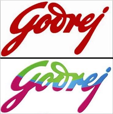
6. Godrej
Godrej has been around since decades in the country and it only made sense for them to adapt themselves according to the changing times. They went for a change in the appearance of their logo in 2008. The logo, which was so far red in colour, now includes maroon, green and blue to give it a more contemporary look. The brand Godrej has also entered the real estate market now.
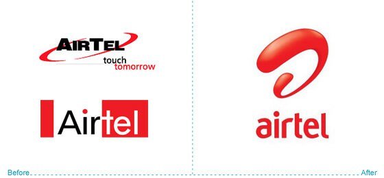
7. Airtel
Airtel happens to be a brand that has changed its logo quite a number of times. And it also changed its image from being the network that connects people to the brand that has a lot of offers for the smartphone-obsessed youth. Time to time, Airtel has always tried to position itself as the friendly brand and might we say, been pretty successful at it. We all remember the Har Ek Friend Zaroori Hota Hai campaign, don’t we?
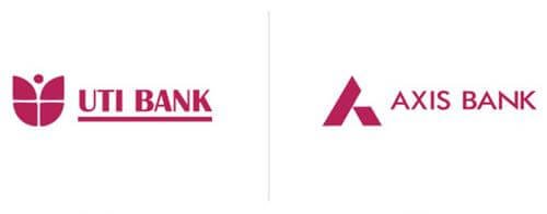
8. Axis Bank
UTI Bank became what we know as Axis today. This happened in 2007 and the intention behind it was to make the brand more contemporary in terms of its appeal, and at the same time, have a name that could transcend geographical boundaries. They also changed their logo and came up with an integrated marketing programme to make sure that the customers remember the name, Axis.
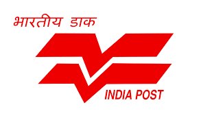
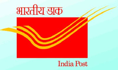
9. India Post
Postal offices have become synonymous with India Post due to its legacy spanning decades. They came out with a full-fledged campaign to create a new, modern face for itself in order to change the perceptions about a government organisation being old and lethargic. They launched a print campaign, Giving Wings To Your Dreams, with a new logo highlighting the new array of services which a billion people could now access to, via India post. This new logo has bird wings which are often confused to be as check marks.
So much behind these ad campaigns no?


