So, if you follow the news or even travel by Uber cabs, you might have come across the new Uber logo. You know the kind which looks like Uber just woke up one day and decided to select a different logo because it wasn’t feeling blue anymore. Get it? even we don’t!
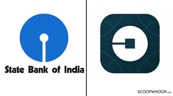
The new look debuted alongside the latest Uber app update, version 2.118.8 where the circle thing just sits there and stares you in the face. Indians might find it familiar – it resembles good ol’ State Bank of India’s logo.

According to Uber, the “heart” of its new app icon is something it’s calling “The bit,” or the central square in the new logo. While that bit will remain the same throughout Uber’s apps and website, the background and even the shape surrounding that tiny square will change to reflect a specific region or design theme.
Uber’s new logo which isn’t a stylized “u” anymore. We are still trying to figure out what it means – an ancient Chinese coin? Key hole? Roads intersection and going places?
Or maybe this lake in Ahmedabad?
The perfectly circular looking Kankaria lake in #Ahmedabad is actually a 34-sided polygon. (pic: Google Earth) pic.twitter.com/vJlLbpbnit
— India in Pictures (@indiainpix) February 20, 2014
In the meantime, it is making Twitter quite uncomfortable. They just can’t cope with the rebranding:
Why does #Uber have a keyhole as their new #logo?
— SparklingSunshine (@AparupaSur) February 3, 2016
Uber changed its logo now I need to retrain my intoxicated self what to look for
— David Pearson (@pearsondavidl) February 3, 2016
And in #Capitalist news today: The new #Uber logo is fucking hideous.
— SAAR (@HediSauvage13) February 3, 2016
Bit risky hey @Uber with your new logo resembling nothing of the old icon? Consistency for users … the brand you created just died.
— Claire Freshney (@ClaireFreshney) February 3, 2016
I don’t know guys, I kind of like the new Uber logo. (the blue ghost represents worker rights) pic.twitter.com/x9PPxz0JdE
— Matt Haughey (@mathowie) February 2, 2016
The new @Uber logo looks like if I press the app I might destroy a small country #uberlogo
— SC (@SophieCurthoys_) February 3, 2016
Why didn’t Uber call me to design their new Logo?
— AshwinSarcasFernands (@ashshanuferns) February 3, 2016


