Pepsi has changed its logo again and it is getting mixed responses on the internet. But this is not the first time this over 100-year-old company has done that. Pepsi logo has changed 15 times since it changed its name from Brad’s Drink in 1898.
Check Out | 7 Popular Brands That Started Out With Completely Different Names
Let’s have a look at all the Pepsi logo changes throughout the years.
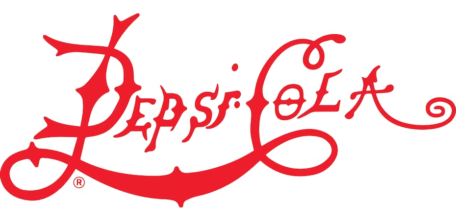
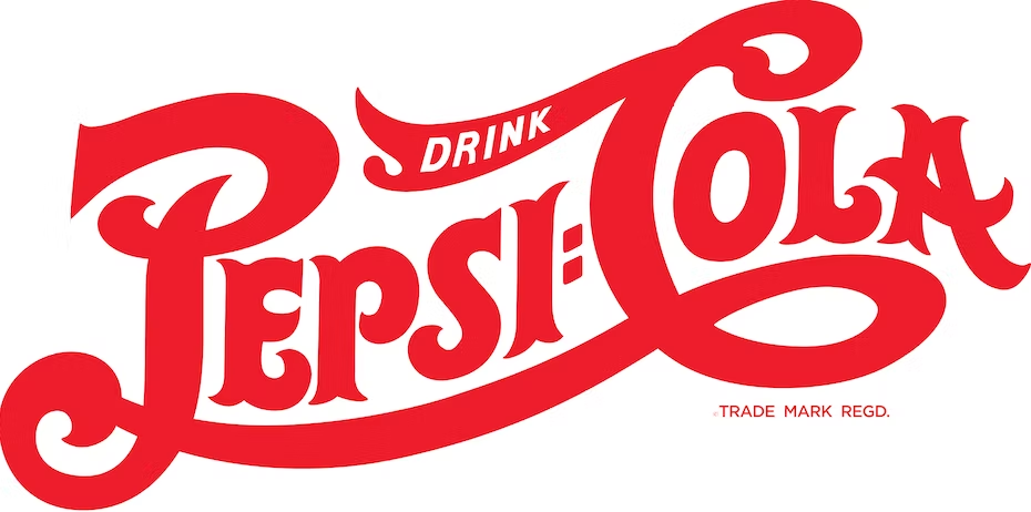
1. 1898 – The Swirly-Curly Red Pepsi Logo
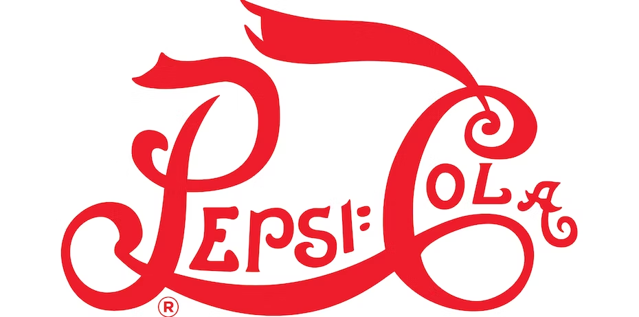
2. 1905 – The Smoothened-Out Pepsi Cola
3. 1906 – The ‘Bold’er Change
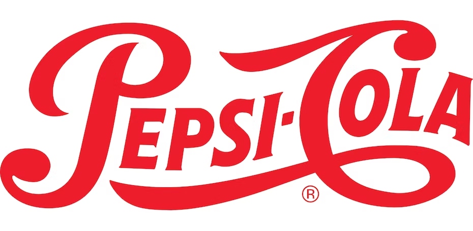
4. 1940 – The Final Red & White Logo
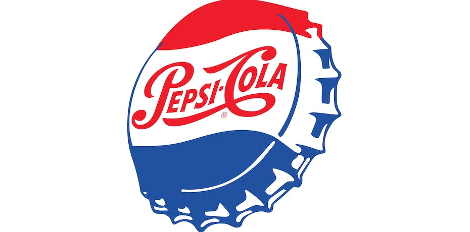
5. 1950s – Bring In The Bottle Cap
ADVERTISEMENT
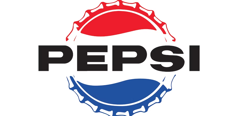
6. 1962 – Say Bye To The Cola
7. 1973 – From Bottle Caps To Sphere
8. 1987 – Lighten The Blues A Bit
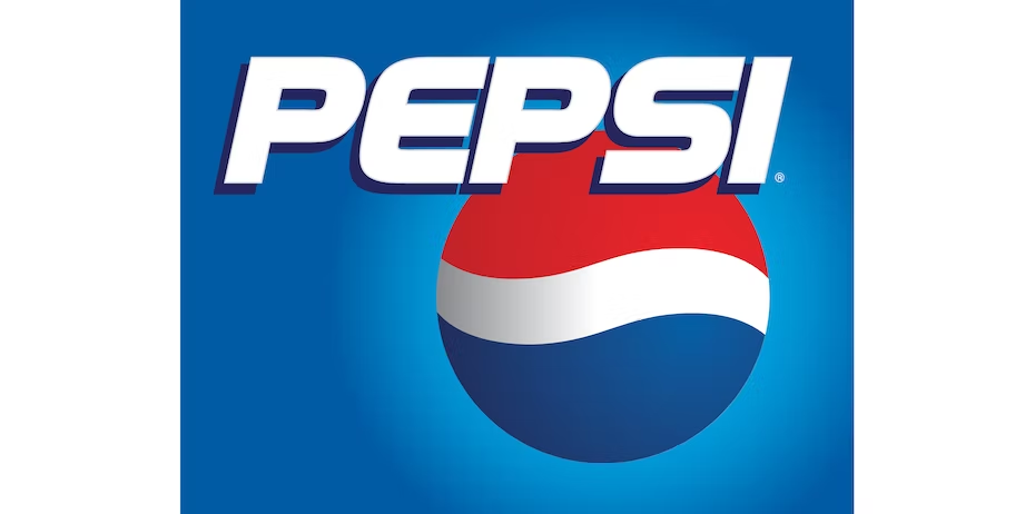
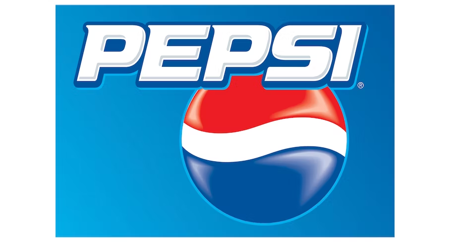
9. 1991 – Pepsi Goes On Top Of The Globe
ADVERTISEMENT
10. 1998 – Pepsi Changes Colour
11. 2003 – Welcome To Pepsi’s 3D World
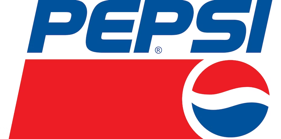
12. 2006 – The Pepsi Logo Looks ‘Cool’
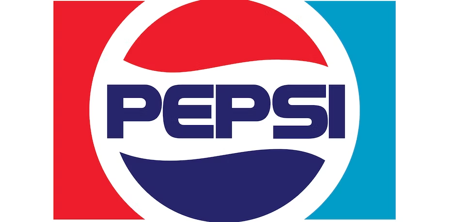
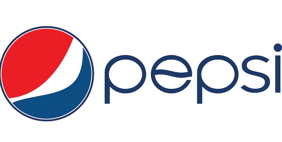
13. 2008 – The More Minimalistic Approach
ADVERTISEMENT
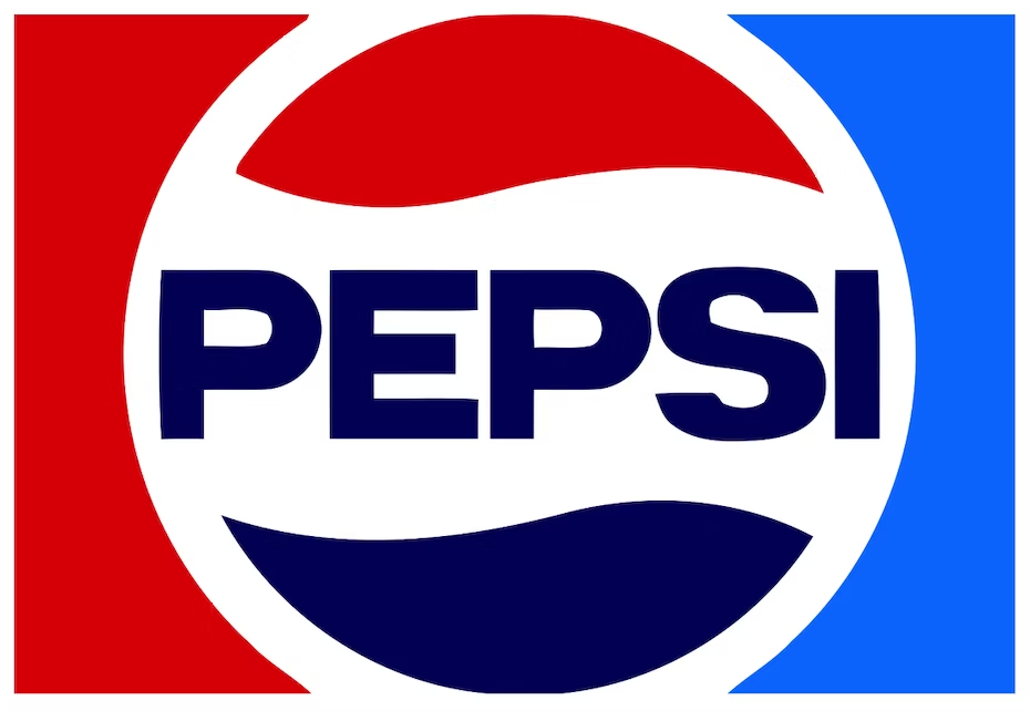
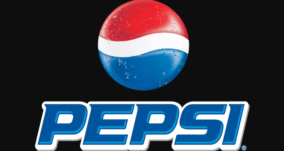
14. 2014 – Say Bye To The Blue Outline
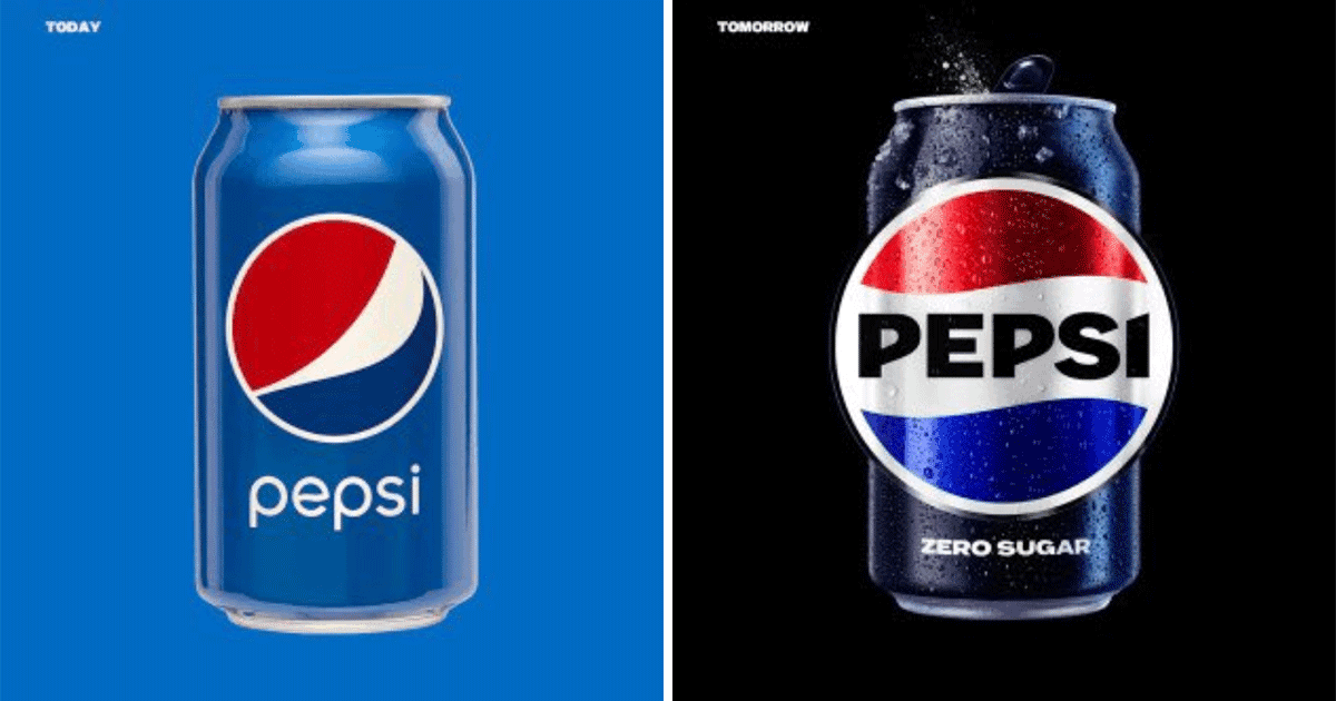
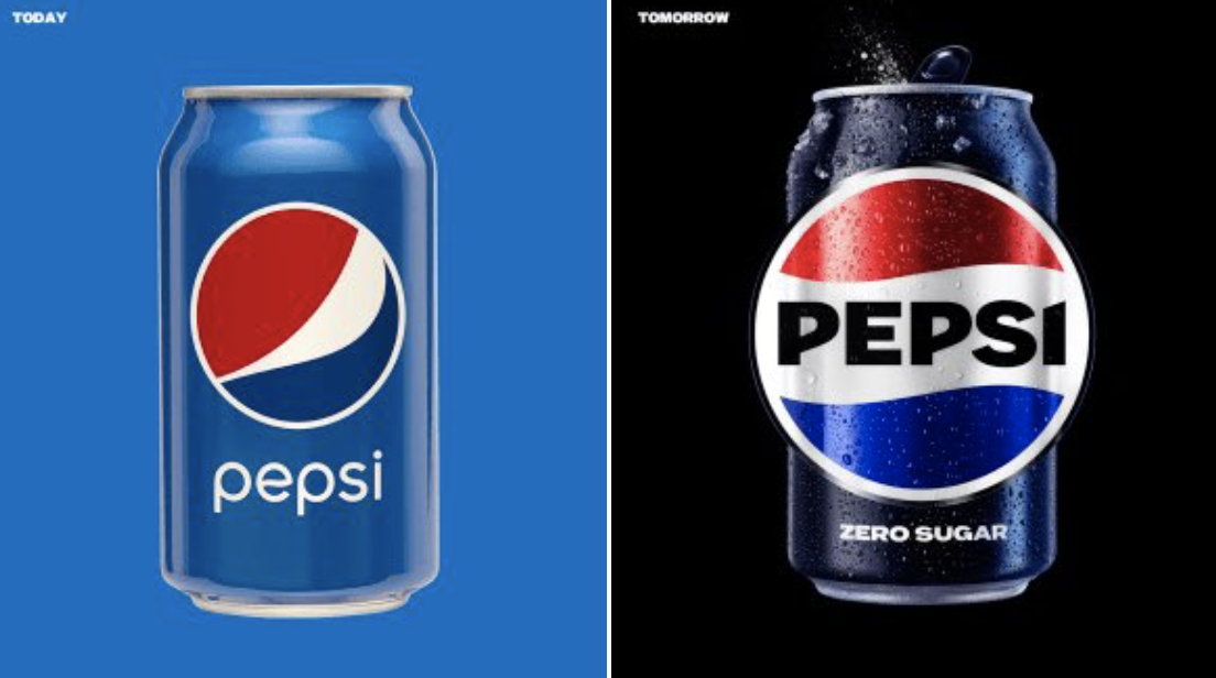
15. 2023 – The Retro Reversal
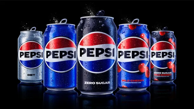
While some think that the new logo looks cool others think they should have kept the previous, more minimalistic one. What do you think about the Pepsi logo changes throughout the years?
Top picks for you