One of the biggest criticisms of comic books has been the overtly sexualized representation of women. Wonder Woman was seen on the big screen for the first time this year and that itself shows how companies perceive female superheroes.
Renae De Liz, an upcoming artist, recently posted a picture on Facebook and gave logical reasons behind drawing strong female characters in comic books the right way, to put an end to the rampant sexism in the industry. While terms like feminism and misogyny are often lost on the masses, pure logic might finally do the trick.
Here’s the Facebook post about the same:
Collection of a discussion over several tweets about drawing women:Q: As an artist, what can I consider if I want to de-objectify & add power to female characters? Tips in this thread
1 Left: A common expression in comics. Eyes are lidded, mouth is pouty. It’s look to promote a sense of sexiness & lessens personality.
1 Right: Personality & Uniqueness first. Think of distinct facial features outside the usual. Promote thought in eyes. Whats she thinking of
2(L): Commonly taught way to draw breasts (OR fully separated/circles/sticking out). Intent to highlight sex appeal, not realistic for hero
2(R): Whats REALISTIC for your hero? Athletes need major support (i.e sports bra) which have a diff. look. Consider not ALL heroes have DD’s
ANOTHER NOTE ON BREASTS: If your hero has a zippered top, DON’T unzip it! Breasts can easily fall out during hero work, which would be silly
3: Arms are closer to supermodel size on the left. What best fits your hero? If she’s strong, she’l likely very built. Give her muscles!
4: Hands on left are set in a way to promote the sense of softness, it lessens her power. Be sure hands are set in a way to promote strength
5(L) It’s common to see “the arch n’ twist” in comics. A female arched & twisted to show both cheeks AND both boobs.
5(R): Twists in the body are a powerful art tool but stick to what can realistically be done, and use arches w/o intent for “boob/butt perk”
6: One on left feels like she’s posing. Right feels like she’s standing heroically. Make her overall pose functional vs. sexually appealing
7: Heels! Modern heels are generally used to amplify stance & increase visual appeal. I like them, but if I were a hero, not too realistic->
7 (cont.) Most important is what would your character choose? It’s very difficult to hero around in stilletos. Perhaps consider low/no heels.
Chose Power Girl (W/ boob window) b/c shes often objectified & show even she can be drawn differently if an artist considers certain things. Intent is to help those who WANT to promote change in their work (which can be challenging). Not shaming those who choose otherwise.
Drawing women sexy is an automatic response to many artists. Done w/o thought. I was like that for many years until I recognized it
If you choose to draw women sexy, that’s fine! Discussing alternatives and recognizing patterns should not threaten you.
I just touched the tip of the iceberg with this. If you have your own advice, please share it!

With females in the comic book universe most often than not being restricted to being a piece of ass on screen, artists have now started fighting back with wonder creations. This post wonderfully highlights the logical issues with that kind of portrayal.
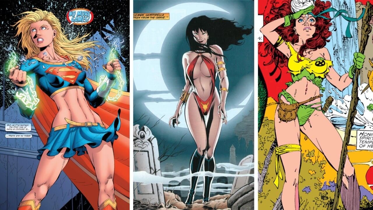
It’s great to see artists using logic to refute the sexualisation of women in comics and not resorting to the age old argument of sexism. We’re hopeful that this explanation will finally drive the point home.