


We know the internet’s everywhere. It’s big. But how big is it really? That’s the question that seems like a natural progression to that investigation. What if you could map out how far spread the internet actually is? What would it look like? Well, the founder of Shodan – a search engine for internet-connected devices – recently came up with the answer.
John Matherly, a self-proclaimed internet cartographer, recently embarked on an interesting project.
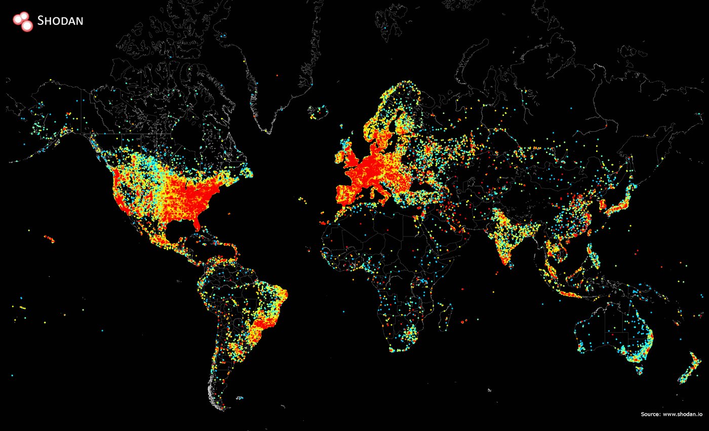
He collected data to put it all together by sending ping requests to every IP address on the internet, and storing the positive responses. This was basically a manner of being able to recognise all the IP addresses that are currently functional in the world; the easy part.

While data collection was easy, the actual plotting of the map was fairly time consuming.
Matherly used the matplotlib plotting library in the programming language, Python. While authorities still consider the practice illegal, Matherly insists that its benign. Shodan was well-known to have potentially shady practices it indulged in, like mapping out pretty much every IP address in a matter of hours. Either way, Matherly ended up mapping out all internet activity gong on in the world. And it looks like the image below:
This doesn’t have to be shady business.
Masthead Source: commons.wikimedia.org


