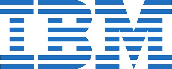
IBM, which started as the International Time Recording Company (ITR), in 1888, changed several names and logos before it came to be called the International Business Machines Corporation. The current logo, designed by Paul Rand, was introduced in 1972. The horizontal stripes forming the letters IBM are suggestive of the ‘speed and dynamism’.
One look at the logo and we instantly know which brand it is. That’s the power of a logo, it can either make or break a company. Creating a successful logo isn’t child’s play, and all the big brands have one thing in common: brilliant logos!
Almost every established brand has a history and some interesting story as to how – after a lot of brain-storming and research – the designers and marketeers came up with the logo. Here we look at 15 brand logos, their history and the hidden meaning.
1. IBM
2. Google
3. Nike
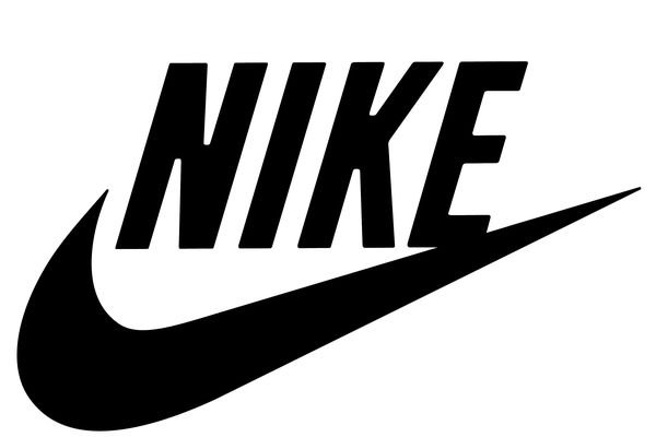
Nike has a simple yet powerful logo. Nike is the Greek goddess of victory. The logo is derived from her wing, ‘Swoosh’. Greek mythology says that Swoosh is the giver of immense power and motivation to the warriors. This makes it the perfect logo for an apparel and accessories brand for sportspersons.
4. BMW
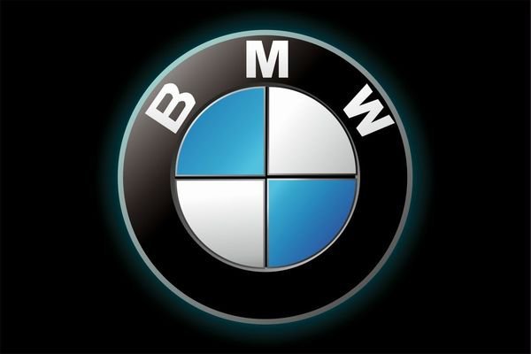
The BMW logo speaks of its history in aviation during World War II, when the company used to create aircraft engines for the German military. The blue and white in the logo depict the propeller in motion, with the sky peeping through it.
5. Nestle
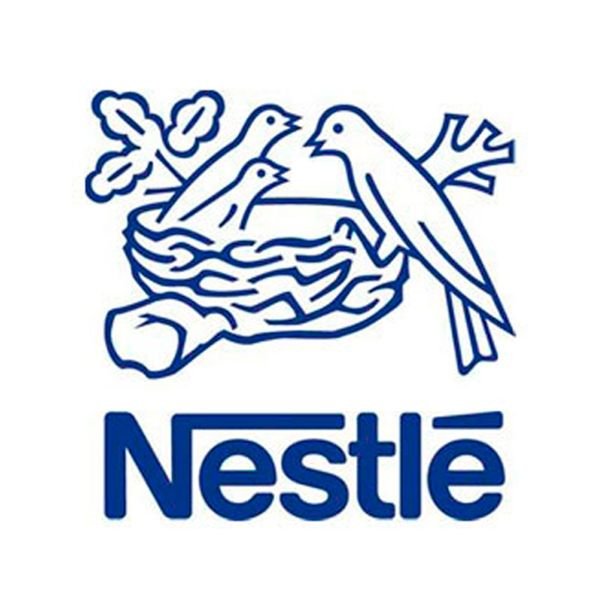
The Nestle logo was designed in 1868 by Henri Nestle, based on the meaning of his name in German. The logo also included a little nest, and his family emblem. Later on, as the logo evolved, the mother bird’s beak was removed and the three fledglings were reduced to two to depict an average modern family.
6. Baskin-Robins
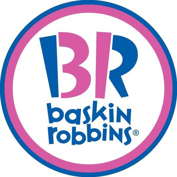
Burt Baskin and Irv Robbins, the two brothers-in-law, started their separate ventures of selling ice-cream in 1948-49, which was later named as the Baskin-Robbins Ice Cream, in 1953. A local advertising agency recommended them the “31®” logo, representing a flavour for every day of the month. The advertising agency, Ogilvy and Mather, is behind the present logo design, which cleverly inscribed 31 in the name.
7. Adidas

Adidas is one of the world’s best sports brands. Many believe ‘ADIDAS’ stands for ‘All Day I Dream about Sports’. But this isn’t true. It’s actually taken from the name of the founder, Adolf Dassler. The logo has a three-stripped mountain on top of the word Adidas, to inspire athletes to achieve great heights.
8. Apple
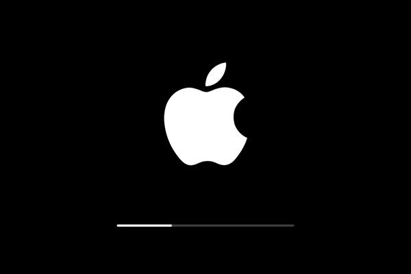
Apple’s first logo, designed by Ron Wayne, depicted Sir Isaac Newton sitting under an apple tree. This logo was immediately replaced by a rainbow apple, designed by Rob Janoff. The motive behind a bitten apple was so that people don’t confuse it with a cherry. And the coloured stripes were there to make the logo more accessible, and to make it known that Apple II could generate graphics in colour. Later the company adopted the monochromatic styled logo, as it allows greater flexibility while branding its products.
9. Amazon

Amazon is one of the prominent online retailers in India. The name Amazon denotes the vastness of the store directory. Also there is an arrow which moves in the direction from ‘A’ to ‘Z’, hinting that the store has everything from ‘A’ to ‘Z’!
10. Picasa
By the looks of it, the logo seems to represent a camera shutter. But that’s not the only thing. The name Picasa is based on the Spanish word Casa, which means home. The motive behind the logo was to indicate that the site houses all your pictures. Look carefully and you’ll spot a house in the middle of the colourful shutters!
11. Sony VAIO
The Sony Vaio logo very intelligently incorporates the idea of analog and digital technology. While V and A of the logo represent the analog waves, I and O resemble the numbers 1 and 0, representing the digital signal!
12. Toyota
Toyota was originally named Toyoda, based on the family name of the founder, and was sold with the Toyoda emblem. The name was changed in 1936, following a public competition to design a new logo. The present logo has three ovals combined in a horizontally symmetrical configuration. The two perpendicular ovals, inside a bigger oval, represent the heart of the customer and the heart of the company, respectively. The outer oval, which overlaps them, represents a mutually beneficial relationship of the customer with the company.
13. FedEx
The FedEx logo is brilliantly designed. It is the winner of over 40 design awards and is considered one of the best logo designs for the clever use of negative space. The hidden arrow, connotes forwards direction, speed, and precision.
14. Mercedes Benz

In the 1870s, Gottlieb Daimler, one of the founders of Daimler-Motoren-Gesellschaft (DMG), the company which originally owned the Mercedes brand, sent a postcard to his wife. He marked his residence with a three-point star, and wrote “One day, this star will shine over our triumphant factories”. Later on, his sons – Paul and Adolf Daimler – suggested the star logo to the DMG board, in the 1900s, after the brand’s success.
15. Audi
Audi means ‘to listen’ in Latin. It was founded after August Horch was forced out of his former auto company, Horch. In 1932, an auto union was formed by the merger of Audi with Horch, DKW, and Wanderer. This merger was represented by the four interlinked rings, which later on became Audi’s official logo.
Now that’s called branding!