Mastercard has one of the world’s most recognisable symbols, with the red and yellow overlapping circles and used across more than two billion plastic cards worldwide.
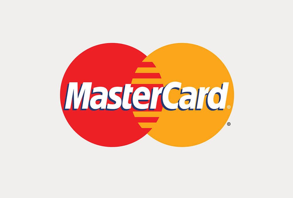
Although Mastercard’s corporate branch had a logo refresh in 2006, the company has stuck with the same public design since 1996. Now after 20 years, in a major overhaul, design agency Pentagram has created a new logo and visual identity for Mastercard to give it a more modern yet simplified look.
The new design retains the two overlapping red and yellow circles, but swaps the stripes in the central portion for a block orange colour.
This is how it looks now:
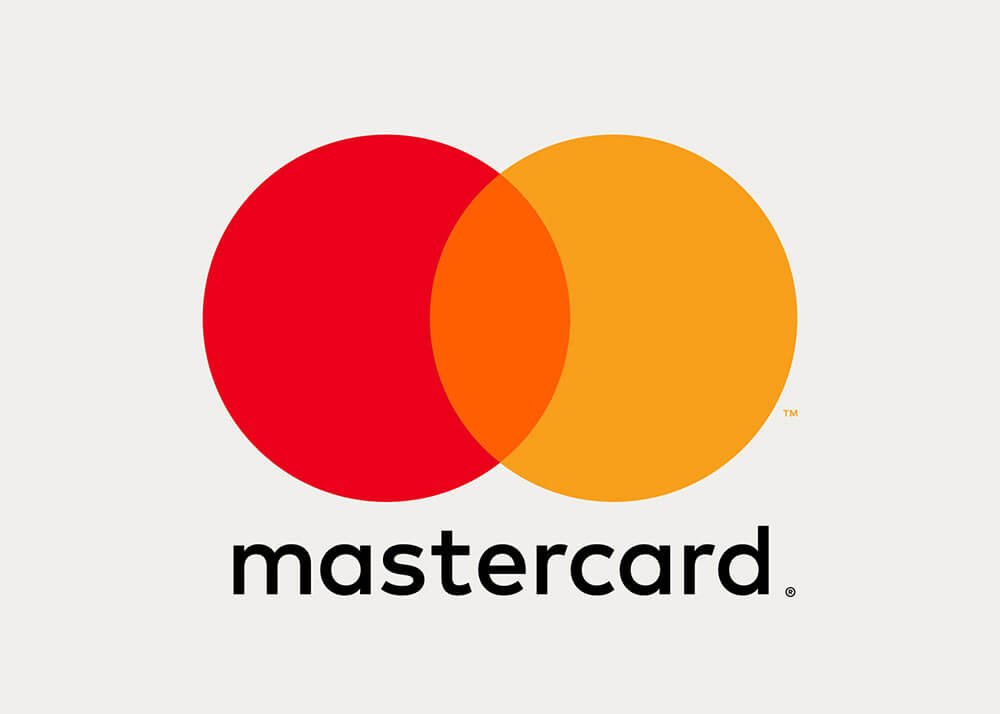
This combination aims to cement an idea of “connectivity” and “seamlessness”, one of Mastercard’s main brand messages. The translucency of the central orange colour also aims to reflect a sense of “transparency”, says Pentagram, while all three colours are now lighter and brighter to convey “optimism”.
Raja Rajamannar, chief marketing and communications officer said, “To thrive in this new digital world where business moves faster than ever, we want to modernize and elevate the brand in a design that is simple and elegant, yet unquestionably Mastercard.”