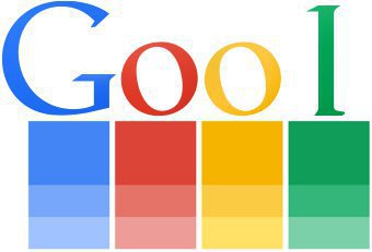
Have you ever wondered why Google’s logo contains different colour combinations? Some say it has a logical and mathematical reasoning behind it whereas others say that it might just be out of randomness. Google revised its logo in 2015 with slight modifications from time to time since 1999. Let us look at the reasons why they probably chose two blue, two red and only one green and yellow colour.
1. Breaking a regular colour pattern shows that Google doesn’t follow the rules
According to Ruth Kedar, there were a lot of different colour iterations. So they ended up with the primary colours, but instead of having the pattern go in order, they put a secondary colour on the L, which shows that Google doesn’t follow the rules.

2. They used a different colour for each prime position and repeated it for a composite position
This might just sound bizarre, but there is a theory that colours are assigned to letters according to whether their positions represent a prime number or don’t. Letters number 1, 2, 3 and 5 have a distinctive or “prime” colour assigned: blue, red, yellow and green. Letters number 4 and 6 (composite numbers) repeat colours in the same order that such colours were assigned in the first time: blue and then red.
3. They started with the primary colour pattern and ended with the RGB colour scale
When we are dealing with arts, the first three primary colours are blue, red, yellow which was followed by Google as well. But when developing software, however, the colour scale is RGB, which explains why the next 3 colours are red, green and blue.
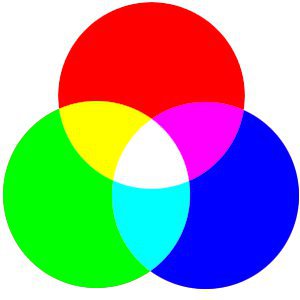
4. They combined the primary colours of paint and light, with a little aesthetic reasoning
Red, yellow and blue are the primary colours when considering paint.
Red, green and blue are the primary colours when considering light.
So it would be logical to combine these two to get
G = blue
o = red
o = yellow
g = blue
l = green
e = red
As for the order, it’s possible that it was just for aesthetic reasons and to avoid starting with red.
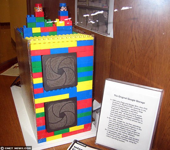
5. Colours of the logo are reminiscent of the first Google server built from Lego bricks
Google’s first server rack was built from Lego bricks, as the team considered it a more cost-efficient (and expandable) way to secure ten 4GB hard drives. The colours included in it were red, yellow, blue and green, same as the logo.
According to some people though, the logo was just done as a joke as they thought it will not be as big as it is now. The more you know!