DISCLAIMER: The images shared in this article are from an international website. They are in no way a representation of ScoopWhoop’s views.
Have you ever looked at the map of the world and wondered how big Greenland is? Never? Okay, do that now. Here’s a world map.
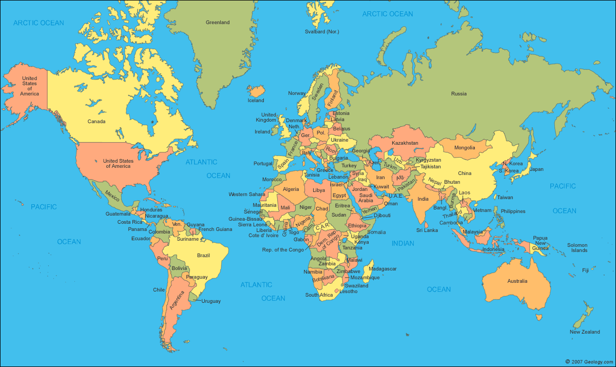
Now you see how huge Greenland is? It actually looks almost as big as Africa. The truth, however, is that there are as many as 10 countries bigger than Greenland. Then why does it not look like that?
Because maps aren’t accurate. They are two-dimensional representations of a sphere, which cannot be accurate. The maps that we usually see are Mercator Projections. They imagine the earth as the surface of a cylinder. It solves the basic purpose maps were built for, helping ships navigate.
However, the lines of longitude are supposed to converge at the poles, and in a cylinder they are parallel. So the closer you get to the poles, the bigger landmasses get on the map. Thus, Greenland (2.2 million km sq.) looks as big as Africa (30.4 million km sq.)
To help people visualise how big the countries would look if they were in the same longitudinal range, James Talmage and Damon Maneice have developed an interactive map called The True Size Of.
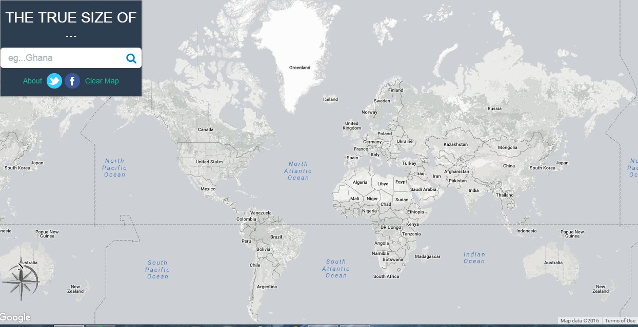
This map allows the user to search for a country or a US state and drag it anywhere on the map to show how big it would look like at a different longitude. And it’s pretty fun to play around with.
To start off, let’s go to Greenland and see how big it would look like when placed next to Africa.
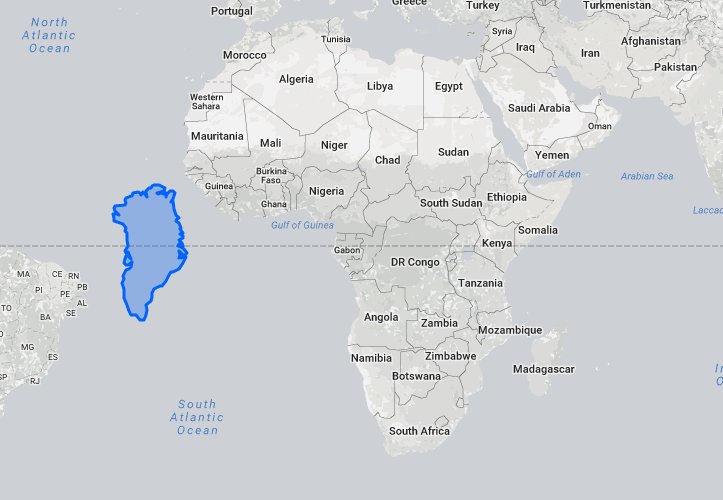
Doesn’t look so big now, does it?
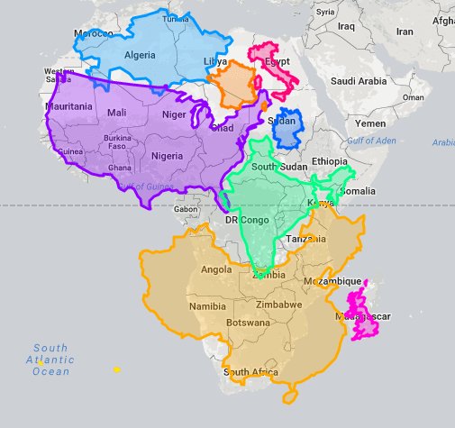
In fact, Africa is so big it is larger than the USA, China, India, Kazakhstan, France, Germany, Italy and the UK put together.
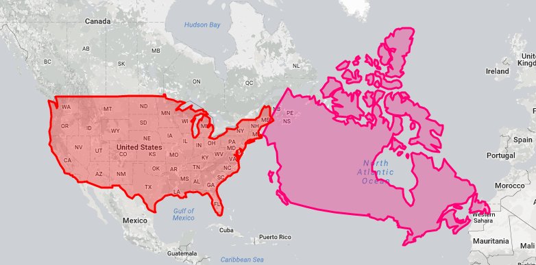
Another country that has the advantage of seeming too big is Canada. See how big it looks compared to the US.
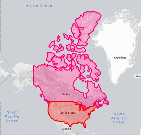
But once you drag it down to the same longitude as the US, it’s not so much bigger.
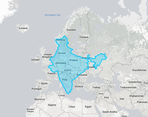
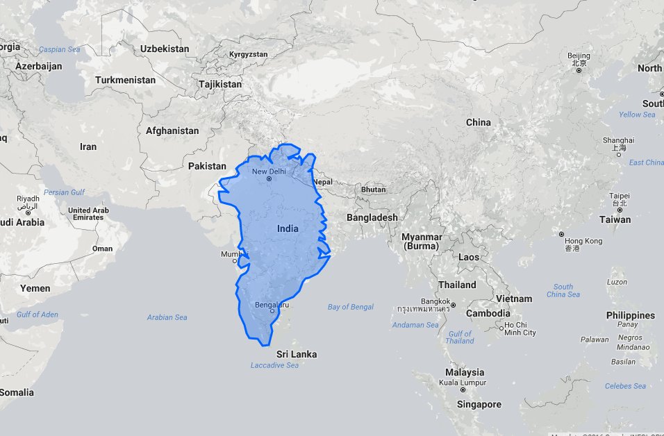
Let us compare India now.
India, owing to its location close to the equator, does not look very large. But if you drag it north close to Europe, you’ll see that it almost as large as half of the mainland Europe.
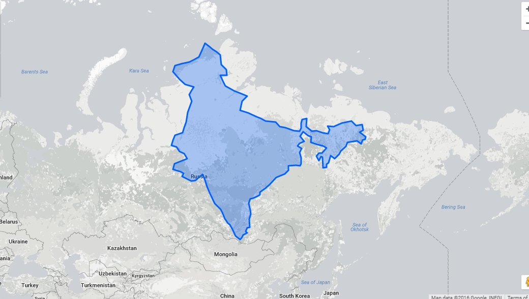
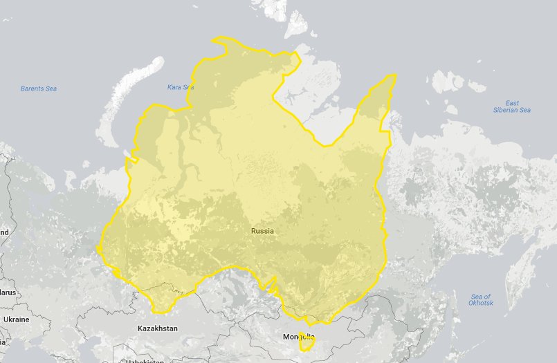
And take it a little further north to Russia, this is what India’s size becomes then
And this is how Greenland, the most oversized place on the map, looks when compared to India.
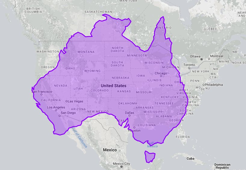
Same happens with Australia, which does not look particularly large on the map. But if you superimpose it on the US or Russia, you’ll get a good idea of how huge it is.
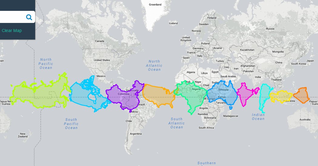
Let us now look at the sizes of the biggest countries of the world. So here are the 10 largest countries – Russia, Canada, China, USA, Brazil, Australia, India, Argentina, Kazakhstan, Algeria – all lined up along the equator to help you compare their sizes in a better way.
So what are you waiting for now? Go to the website and have fun dragging countries north and south. And tell us which coutries you think have the biggest advantages and disadvantages on the Mercator projection.