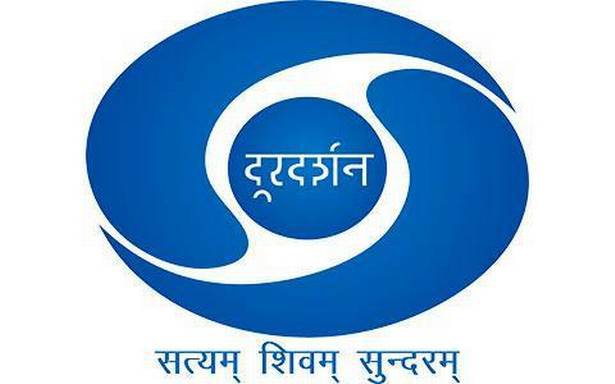
Doordarshan’s iconic logo and tune was an integral part of our growing up years. And even today, it’s hard to picture Doordarshan any other way.
However, Doordarshan decided it was time for change, and conducted a logo competition between July 23 and August 20 last year. Recently, Prasar Bharti shared the shortlisted logos on their Twitter channel.
Doordarshan Logo Contest – Here are the top 5 logo designs selected out of more than 10,000 entries. pic.twitter.com/qV8Ni2Zkj8
— Prasar Bharati (@prasarbharati) May 20, 2019
And the new logos did not go down well with Twitterati at all. Many compared it to the original logo, that was considered to be far better than any of the options that Prasar Bharti shared.
Look at the 4th logo. With a Kabootar. If this was in the Top 5. Don’t know baaki 9995 entries kaisi thi. https://t.co/HL73Rnyf0u
— Gabbbar (@GabbbarSingh) May 21, 2019
These are terrible in their current forms. Logos should never be selected from contests. Hire real designers, pay them, and ask them to build a brand’s entire design language, not just a logo. https://t.co/MV1cHChXsr
— Siddharth Singh (@siddharth3) May 21, 2019
Logo adds beauty and value to the channel . Creativity is to be found in the art of designing it . Short listed logos are not looking good as can be verified from the comments . Better simply write ‘ DoorDarshan ‘ and above it the region specific name in an attractive colour .
— Ravisankar (@erssarma) May 21, 2019
The current logo of @DDNational is way better than these options…. plz dont change
— Shahnawaz شاہ نواز (@shahnawazk) May 21, 2019
Prasar bharti.. really??? That’s the best you could find? Instead of these embarrassments, stick to your old logo. Or reopen the contest for better entries! https://t.co/Vpfxr8kdiG
— Raghu (@raghukalra) May 21, 2019
Fire the selection committee . This is worse than clipart!
— Anusha Yadav (@anushayadav) May 21, 2019
Sach batao kitne entries aaye the? Kyunki apne desh ka talent pool itna kharab nahi ho sakta.
— Krishna (@Atheist_Krishna) May 21, 2019
Crowdsourcing at it’s worst. I cannot believe that these are the top five logos from a population of more than a billion @srishagrawal
— Abhishek Rungta🎯 (@abhishekrungta) May 22, 2019
Please don’t select any of these. I will be more than happy to market your contest free of cost and get quality entries @shashidigital https://t.co/2czQG7gKfz
Unbelievable! Doordarshan definitely deserves a better logo 🙏 https://t.co/Bn7eEbZJaj
— Kuntal Chandra (@kuntalchandra) May 22, 2019
Please do not change #Doordarshan logo 🙏
— Abhishek (@Nomadic_MAN_) May 21, 2019
Seeing this logos, old one looks way better!!! https://t.co/KJls9Enzof
primary school mein karwaya tha kya contest?
— Rofl Gandhi (@RoflGandhi_) May 21, 2019
Nothing even closer to the #iconiclogo of @ddnational which we’re accustomed since childhood days.
— Rahul Basu (@raahulbasu) May 21, 2019
Doordarshan’s Iconic Logo Will Soon Be History. See Shortlisted Designs https://t.co/kp5xQmBaKP via @ndtv
Best pic.twitter.com/wwfMJxqPya
— Chowkidar காஸ்மிக்பிளின்கர் 🇮🇳 (@cosmicblinker) May 21, 2019
hi. all of them suck
— ਣ (@jeyaunamaurh) May 21, 2019
petition to give all entries pat on the head and re-create the classic doordarshan logo in high-fidelity https://t.co/oJ5qAAmFiK
These look really awful.
— Deepanshu Natani (@DeepanshuNatani) May 21, 2019
Out of 10000 entries, if these are the 5 top logo designs selected, then you need to change the team who selected these awful designs and not the logo! #doordarshan
The original logo – that was created by Mr. Devashis Bhattacharya, then a student of Visual Communication, National Institute of Design (NID) – was also a result of a classroom exercise to create logos. But the current response seems to suggest that perhaps there were better entries the last time around.


