


If the internet could be considered as an entire race, it’s god would unquestionably be Google. However, the all-knowing, all-powerful deity of the internet isn’t without mistakes and it seems that a few of his flaws have been caught by perfectionist mortals.
And as it turns out, Redditors have found faults within Google’s logo itself.
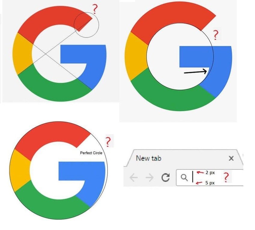
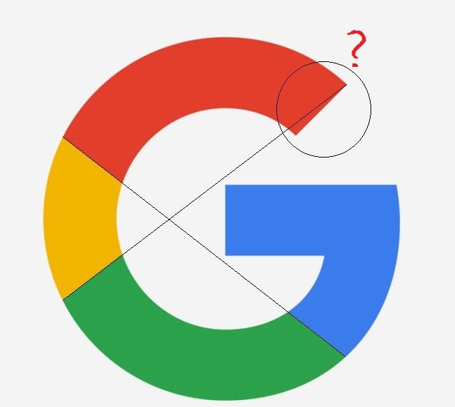
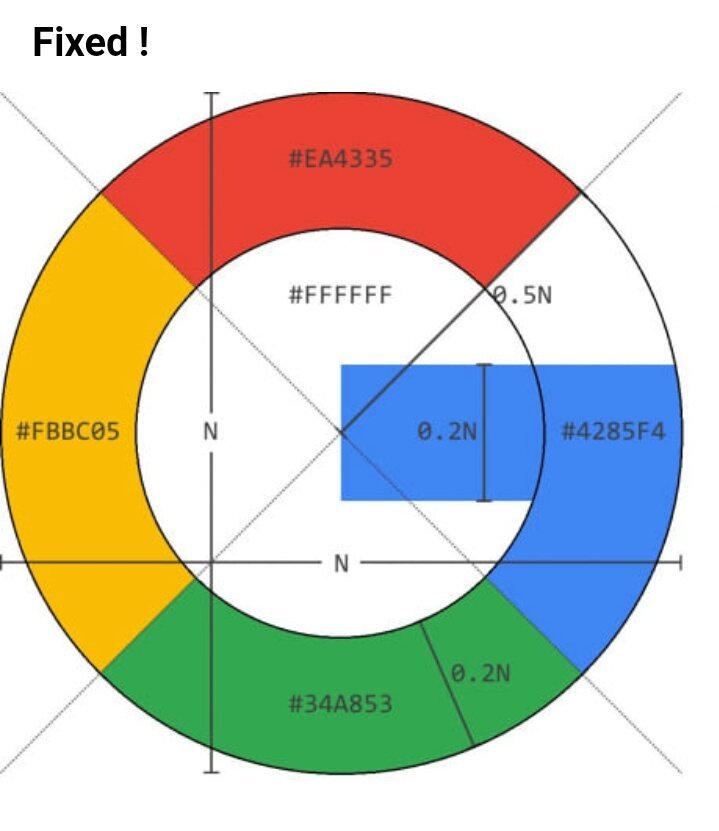
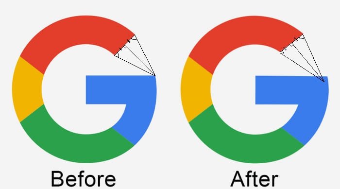
The Google Logo is asymmetric AF.
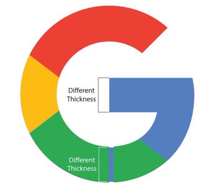
There have also been complaints about the varying thickness of the logo.
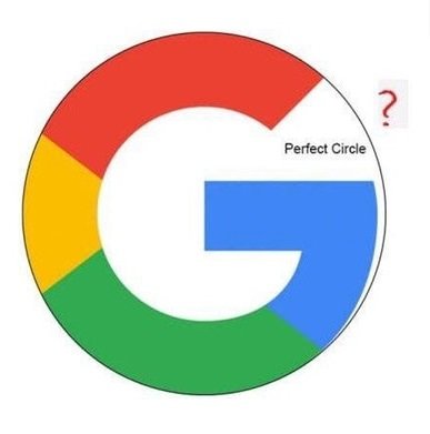
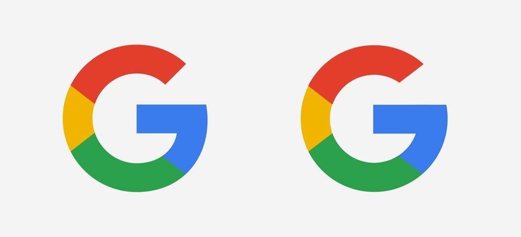
People have also pointed out how geometrically imperfect the logo is.
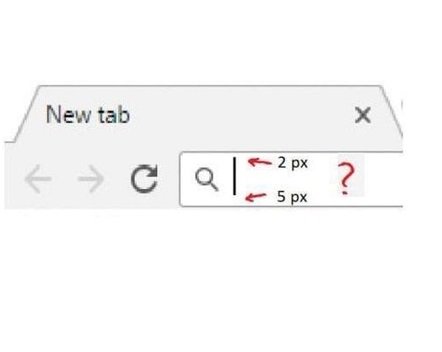
Even the address bar was put under the radar by the internet.
Few others seem to have not stopped the nitpicking and have come up with ways to fix the “problem”.
But all this might not have been a mistake on Google’s part. We mean, come on, a company that goes through so much detailed efforts for a logo is unlikely to overlook such mistakes.
Google says, “Our new logotype is set in a custom, geometric sans-serif typeface and maintains the multi-coloured playfulness —a reminder that we’ll always be a bit unconventional.”
To quote Google’s page about its logo, “The Google logo has always had a simple, friendly, and approachable style. We wanted to retain these qualities by combining the mathematical purity of geometric forms with the childlike simplicity of schoolbook letter printing.”
We really want to believe that Google is perfect without flaws but now that these supposed flaws have been pointed out, it is a little difficult to ignore them.


