The design and layout of any companies logo is given a lot of thought and for good reason. One of the most important factors that contributes to brand recognition is the company’s logo. Google changing its logo seems to have sparked fervid discussions amongst all netizens.
So, we thought you might want to take a look at some other major company logos and how they’ve evolved over time. Here they are.
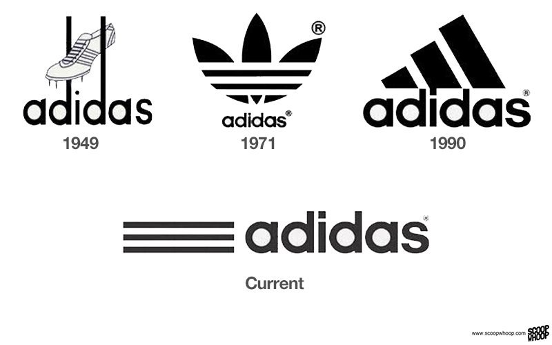
Adidas
Ain’t nothing fresher than than some Adidas. The 1990 Adidas logo is the best logo ever, in the history of ever.
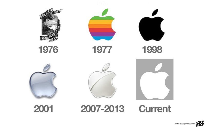
Apple
Steve Jobs always considered simplicity as being stylish.
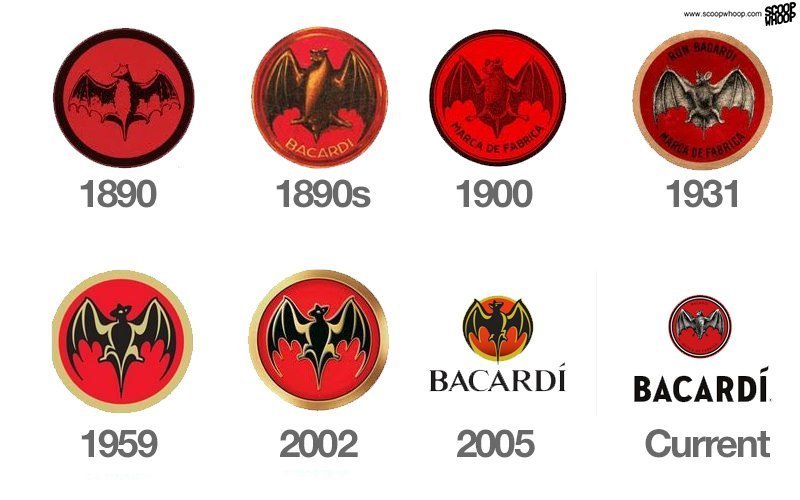
Bacardi
The logo has been brought back to its roots.
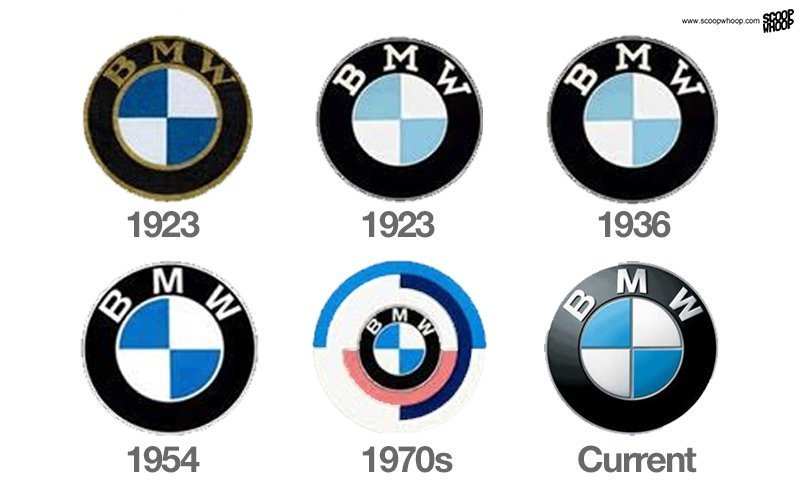
BMW
The classic BMW logo has not been meddled with much.
ADVERTISEMENT
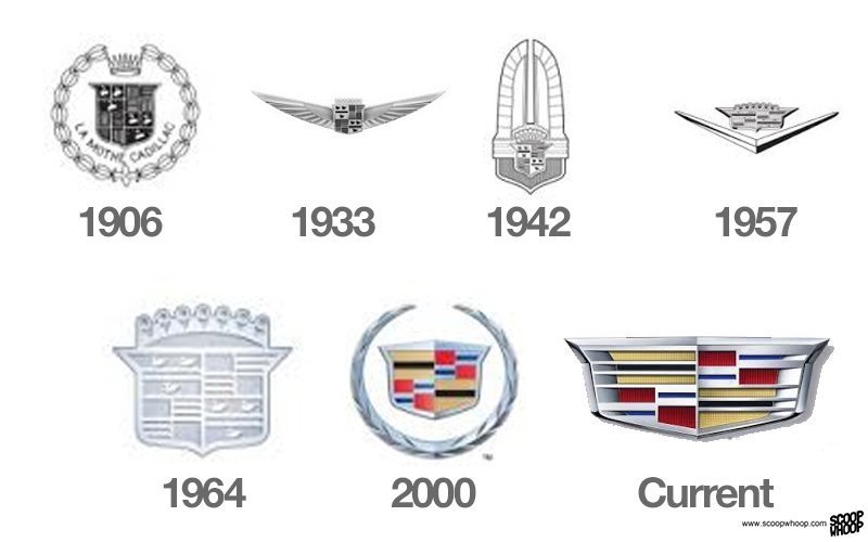
Cadillac
The badge symbol of 1906 has been brought back.
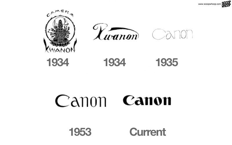
Canon
The new logo is kept less complex than the original.
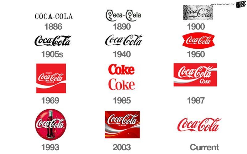
Coca Cola
Who can forget this classic?
ADVERTISEMENT
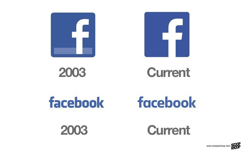
Facebook made subtle changes to its logo in 2013, by removing the dash and changing the font.
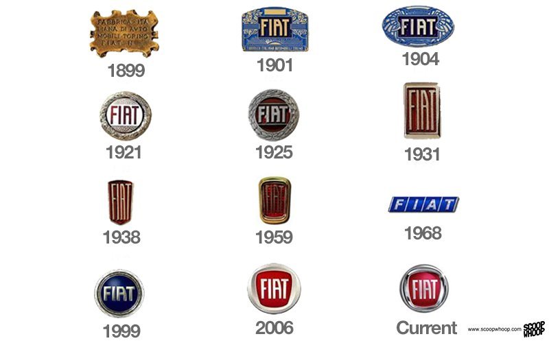
Fiat
There have been drastic changes to this symbol since its inception.
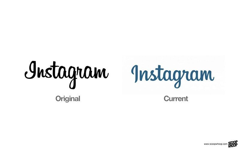
The relatively new company went for a more artistic look by having a writing font in its newer logo.
ADVERTISEMENT
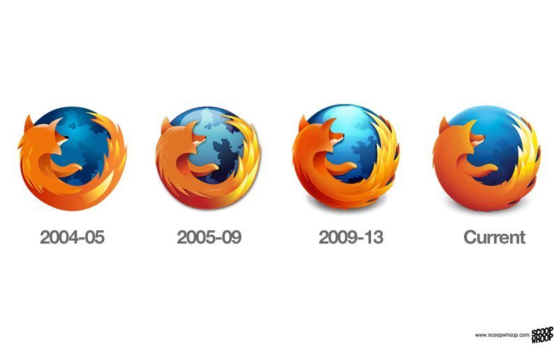
Mozilla Firefox
Barely noticeable, but definitely, the logo has looked more futuristic as it has progressed.
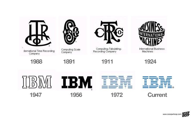
IBM
It was only in 1947 that the simple type font logo of IBM that is very well recognised came into being.
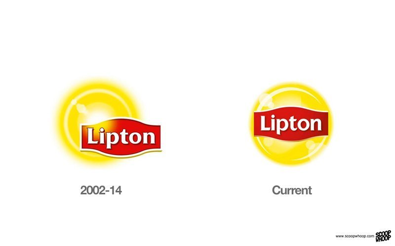
Lipton
The new symbol looks a lot like Lay’s symbol.
ADVERTISEMENT
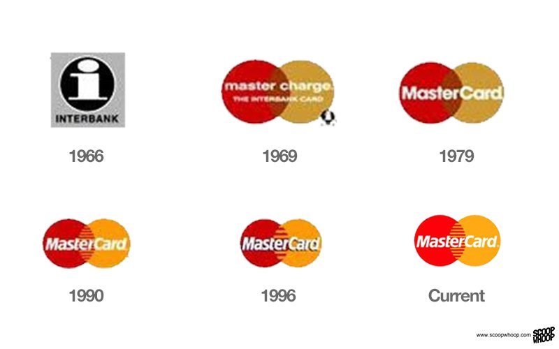
MasterCard
Quite a shift in design from 1966 to 1969. Not much change since.
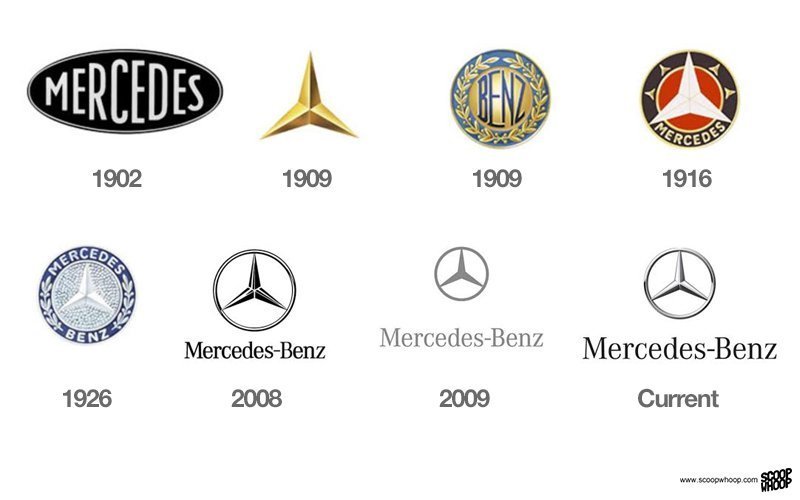
Mercedes
The most well recognised symbol of Mercedes, which is notorious here for being ripped from cars, first came into fruition in 1916.
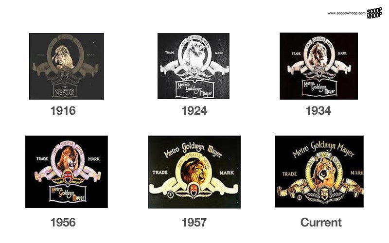
Metro-Goldwyn-Mayer
The logo has not been changed much, but as photography has gotten better, the lion in the middle has gotten more gloriously detailed.
ADVERTISEMENT
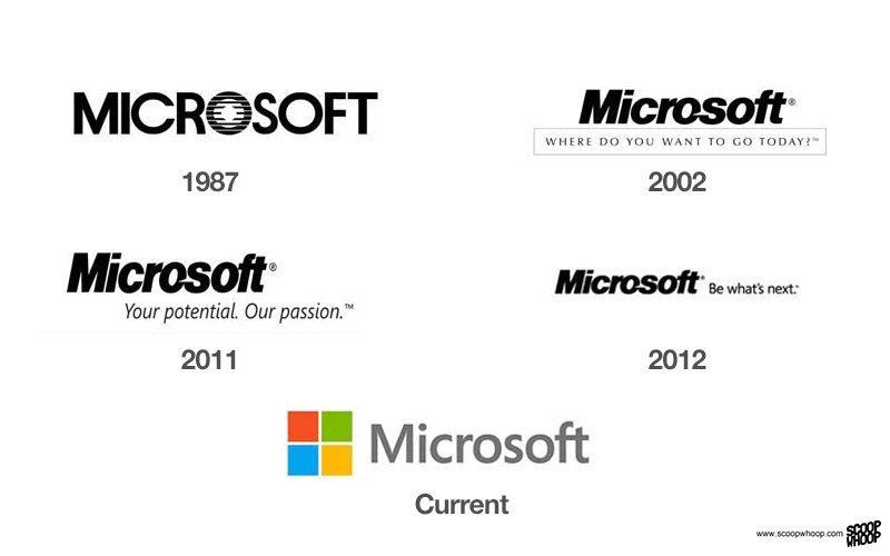
Microsoft
Microsoft has historically gone for a simplistic type font symbol, while the current symbol is a lot more colourful than its predecessors.
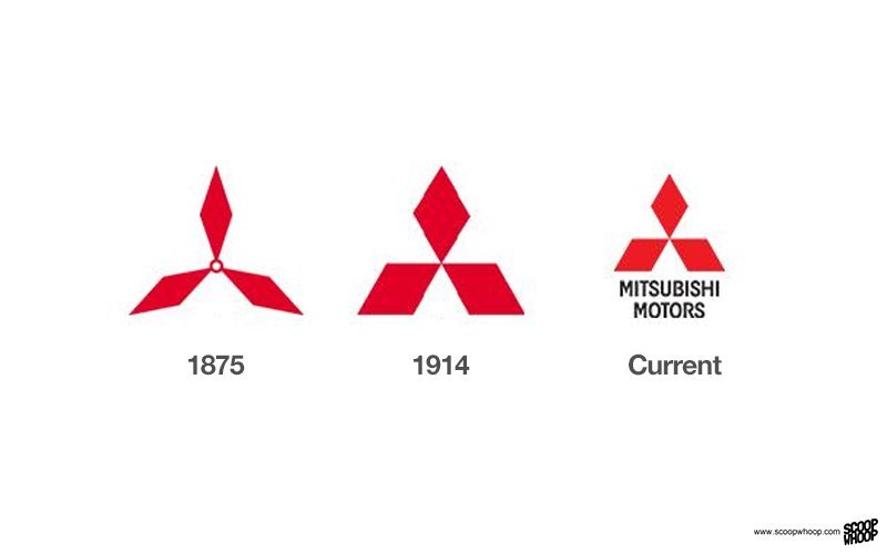
Mitsubishi
A symbol that has endured.
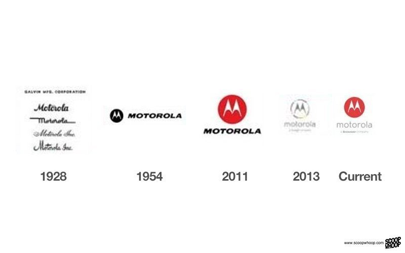
Motorola
Not much has changed since 1954.
ADVERTISEMENT
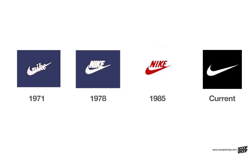
Nike
A symbol so well recognised, there is no need for change. Check and mate.
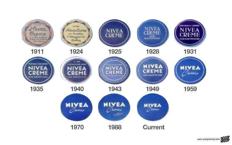
Nivea
Since 1925, there hasn’t been much difference to the look of the logo.
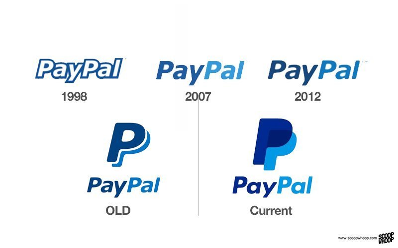
PayPal
The new symbol clearly shows two separate P’s which makes it less ambiguous that the spelling of PayPal is with two P’s.
ADVERTISEMENT
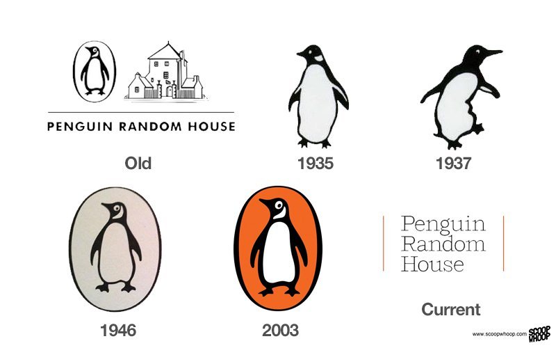
Penguin Random House
A minimalist approach to changing the logo has been adopted by the company.
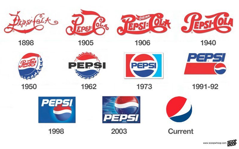
Pepsi
The first Pepsi logo looks a lot like the Coca-Cola logo, which is now completely unrecognisable.
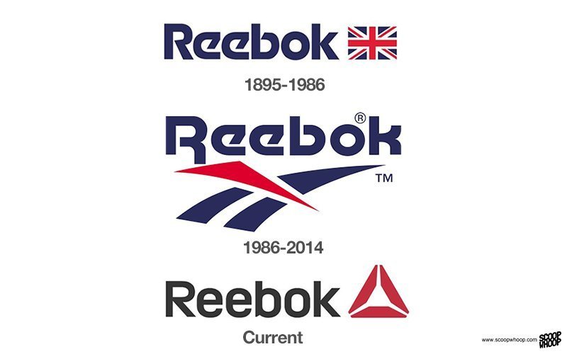
Reebok
The logo is not as well recognised as Adidas or Nike, however, the one used till 2014 was a classic in some eyes.
ADVERTISEMENT
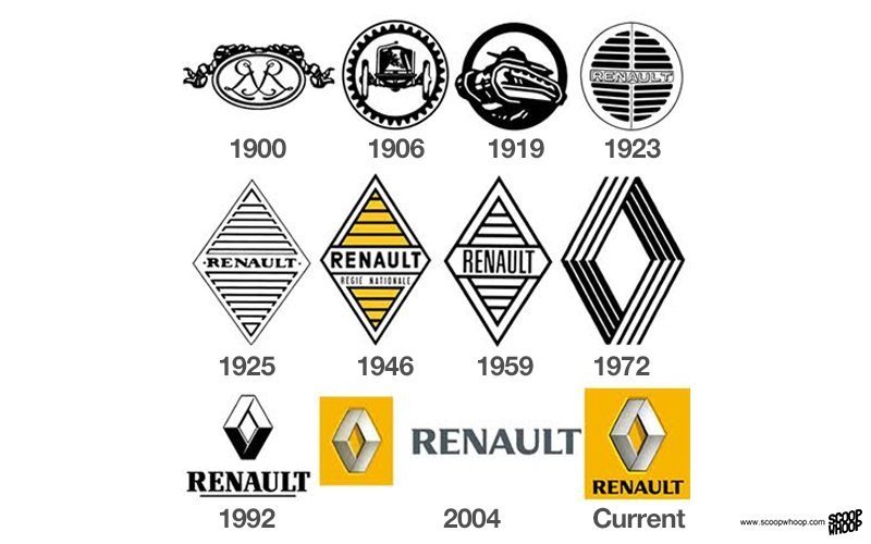
Renault
The logo has not been meddled with much from 1972.
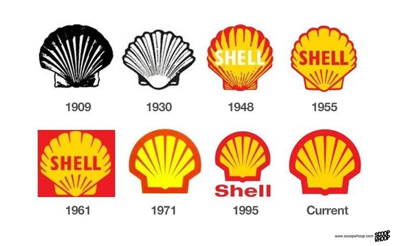
Shell
Another logo that has endured. Since 1909 the shell symbol has only been made more modern, but they never got rid of the shell.
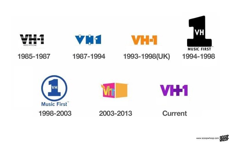
VH1
The ones in 1994 and 1998 stood out, otherwise the logo has remained largely unchanged.
ADVERTISEMENT
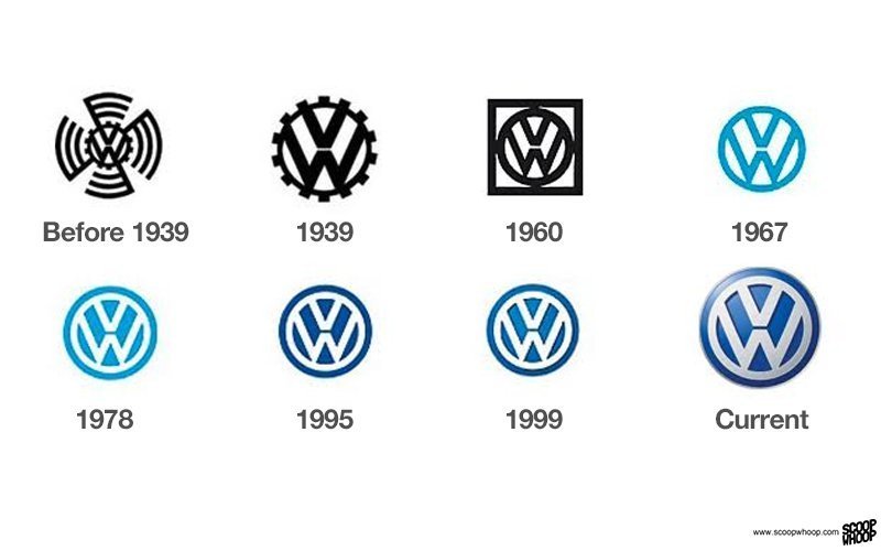
Volkswagen
The logo has always been kept simple and classy.
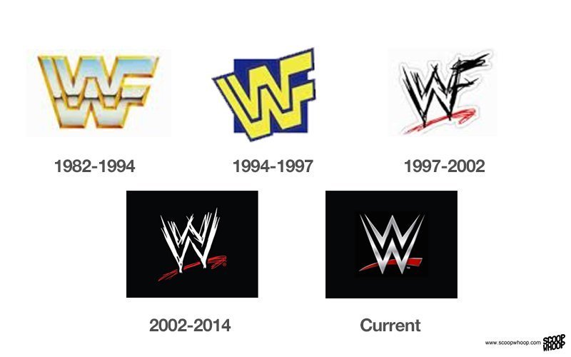
WWE
The logo from 2002-14 was edgier and rougher as compared with the current one, which looks more professional.
Top picks for you