A picture speaks a thousand words. True. And that is what logos do for a brand. They may be small in design but they speak volumes about their brand. Some, such as these, go that extra mile with clever symbolism hidden within it.
These brand logos may look simple to you at first glance, but when you see it, you realize how brilliant they are.
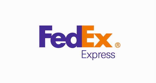
1. FedEx
Did you ever notice the white arrow between E and X?
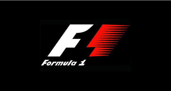
2. Formula One
Can you see the hidden 1 between the red and white?
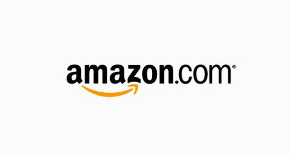
3. Amazon.com
The arrow connects A and Z, meaning you get everything from Amazon. And it also looks like a smile. After all shopping is happiness, right?
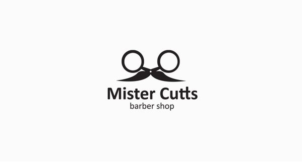
4. Mister Cutts
Moustaches need scissors, right?
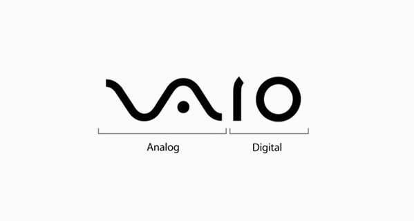
5. VAIO
Well, the logo explains it all.
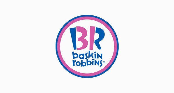
6. Baskins Robbins
Of course you know BR stands for, but did you know how many flavours BR has? The answer lies in pink.
7. Bearhanded
Bearhanded teaches you to trade stock in any market. The name as well as the logo seems to be a clever pun!
8. Barcode
Bar and Barcode, can you see it?
9. Magic Coffee
Behold how the coffee cup turns into a conjurer’s hat! Magic?
10. Codefish
The company’s services range from outsourcing IT to in-house staff augmentation, consulting services to business process automation, mobile to Smart TV apps and more. A code fish for CodeFish. They must be good at what they do!
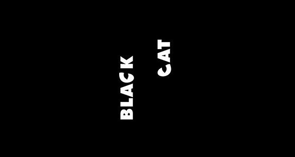
11. Black Cat
Black Cat is a production company (TV Design) located in Turkey. It’s a black cat, so you won’t see it, but if you look closely, you’l see its eyes.
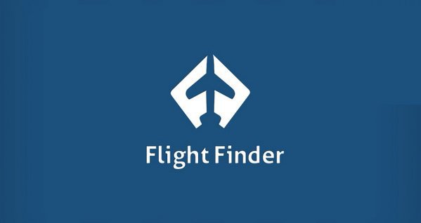
12. Flight Finder
And the logo too, makes you find the flight. Ah, found it!
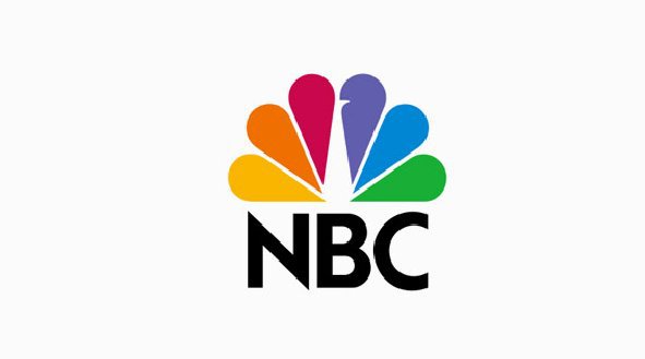
13. NBC
NBC is an American commercial broadcast television and radio network. The peacock in the logo stands for colour and pride.
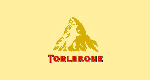
14. Toblerone
Yes, this logo can make all of us drool instantly, but did you ever notice the white bear in the mountain?
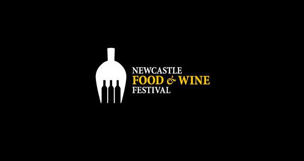
15. NewCastle Food & Wine Festival
Fork for food and bottles for wine, all neatly packed into one clever icon.
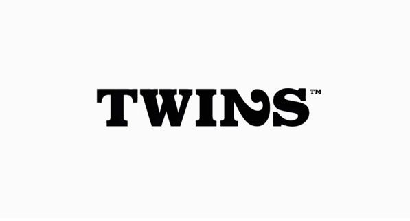
16. Twins
Does the ‘N’ look like a different font?
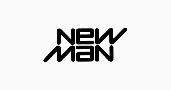
17. New Man
The logo was designed in 1969 and used till date. Looks stylish, but when you flip it you won’t find anything new. It’s an ambigram!
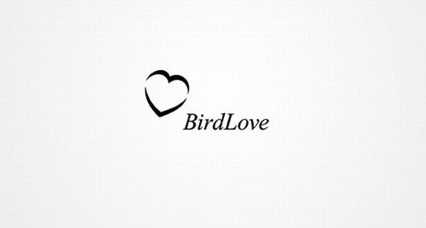
18. BirdLove
Let’s go bird watching. How many can you spot?
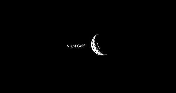
19. Night Golf
Golfball. Moon. Golfball in the moonlight.
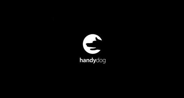
20. Handydog
A hand made dog for Handydog seems just right.
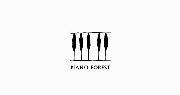
21. Piano Forest
Trees or piano forest for the logo? How about both!
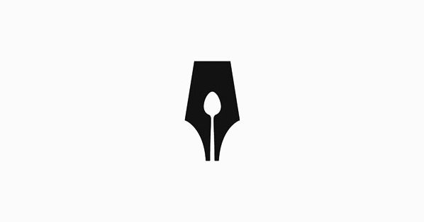
22. The Guild of Food Writers
Which came first, the spoon or the pen?
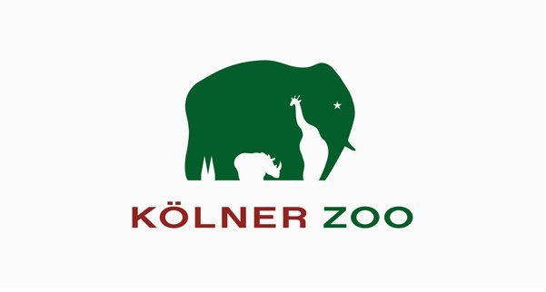
23. Kolner Zoo
How many animals can you find?
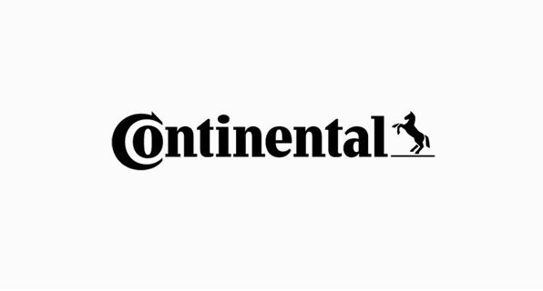
24. Continental
We’re all familiar with this tyre brand but you probably never noticed how the ‘C’ and the ‘O’ form a tyre.
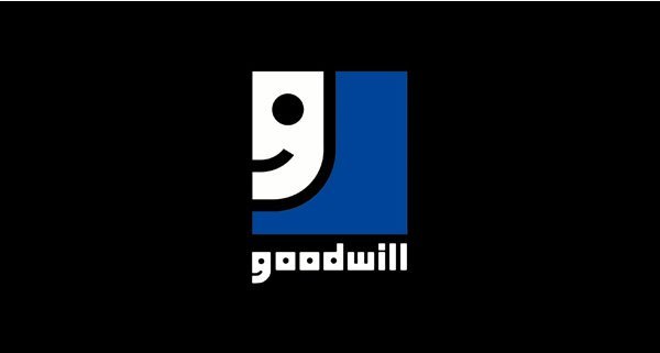
25. Goodwill
There are two smiling faces here. Can you spot them?
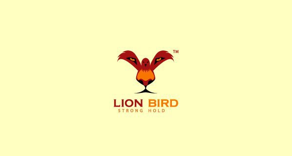
26. Lion Bird
Well, is that a bird or a lion’s face?
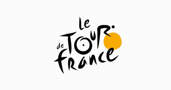
27. Le Tour de France
Is that a ‘R’ or a man cycling on the orange circle?
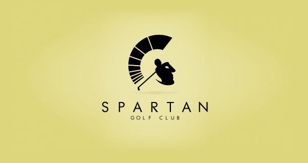
28. Spartan
You see the golfer, but do you see the Spartan?
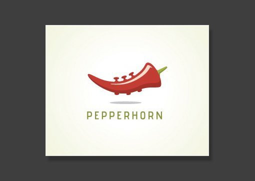
29. PepperHorn
A pepper and a horn.
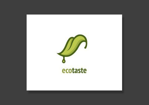
30. Ecotaste
It’s a little creepy, but yeah, the green tongue makes sense.
So what’s your new favorite brand logo?