In this era of mad, mad rat race, chances are you did not realise till now but Times New Roman might just cost you your next job. While resume font choice may seem lightweight, experts believe it’s actually pretty important. No matter how accomplished you are, and how perfectly well you fit in the position, a bad font can take the focus off the accomplishments you’ve listed.
And the worst part is you might still be wondering about that best interview of your life gone wrong!
According to creative director of Brian Hoff Design, using Times New Roman “telegraphs that you didn’t put any thought into the typeface that you selected,” he says. “It’s like putting on sweatpants.”
According to experts, here are the best and worst fonts:
Helvetica is the best font choice to type out a resume
Helvetica is so no-fuss, and does not lean in any particular direction. Easy to read and process, it feels “professional, lighthearted, honest”. It’s a safe font and gives the resume a serious, no-nonsense look.

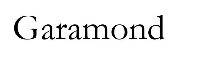
For longer resumes, go with Garamond
Experts believe Gramaond is the best font when it comes to long resumes. “Legible and easy for the eye to follow, it has all these quirks in it, so what that does is allows the eyes to see where it should go.”
AND now, for the most important part, the fonts you should NEVER go with.
Avoid using Courier as a font when you’re typing out a resume
Even if it looks good, and reminds us of old typewritten print, there is not point pretending we typed out using a typewriter when we are printing out a CV. According to experts, “You have been using a computer to do a handwritten thing. You haven’t used a computer properly, and you haven’t handwritten properly.”

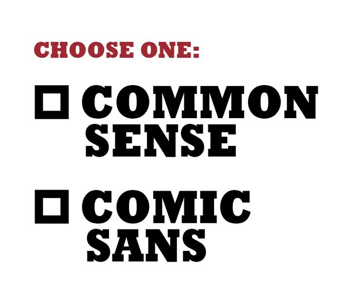
Always avoid the worst of all the fonts – Comic Sans
Until and unless you are planning to apply for a job that’s imaginary, never go with Comic Sans. Not even when you are applying for the job of a clown.

Why, you ask?
Always remember, Helvetica and Garamond are your resume’s best friends.