Ever thought about the meaning of the logo of India’s largest public sector bank, State Bank of India? Read on to find out the answer.
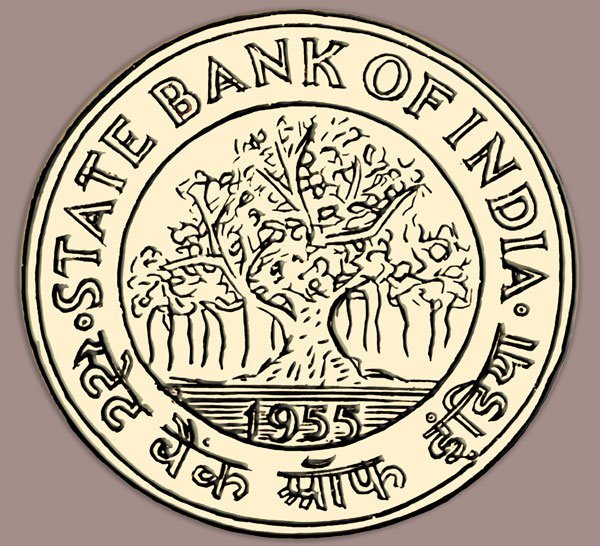
The first emblem for the State Bank of India was adopted in 1955 showing a Banyan tree because of its strong roots and branches which are capable of propagating and growing in all directions, depicting growth, success and stability. However, the logo was abandoned as it invited criticism because of the fact that a Banyan tree does not let any other plant grow within its space.
At present, the logo of State Bank of India is a blue circle with a small cut at the bottom.
It was designed by Shekhar Kamat, an alumni of National Institute of Design, Ahemedabad. The logo was unveiled on October 1, 1971, on the day of inauguration of the SBI Central Office building at Backbay Reclamation, Bombay.

The design of the logo is open to several interpretations.
One of the concepts behind the design of this logo is that the big circle in blue reflects unity and completeness while the white one represents common man as a vital part of the bank, despite the huge size of the bank.

The logo also suggests a keyhole which is said to be the symbol of safety, security and strength.

Another interpretation is that the white circle is the bank’s branch and the vertical line stands for the streets and lanes of any city which leads to the bank’s branch, highlighting that wherever one goes, SBI is there to serve..
It is also said the the inspiration for this design came from the Ahmedabad city’s Kankaria Lake. If you zoom in to Kankaria Lake on Google Maps, this is what you will see.

So, now you know!