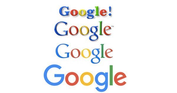
In the 17 years since its inception, Google as a company has changed a lot. The management has changed, the products have evolved and so has the look and the feel of the logo.
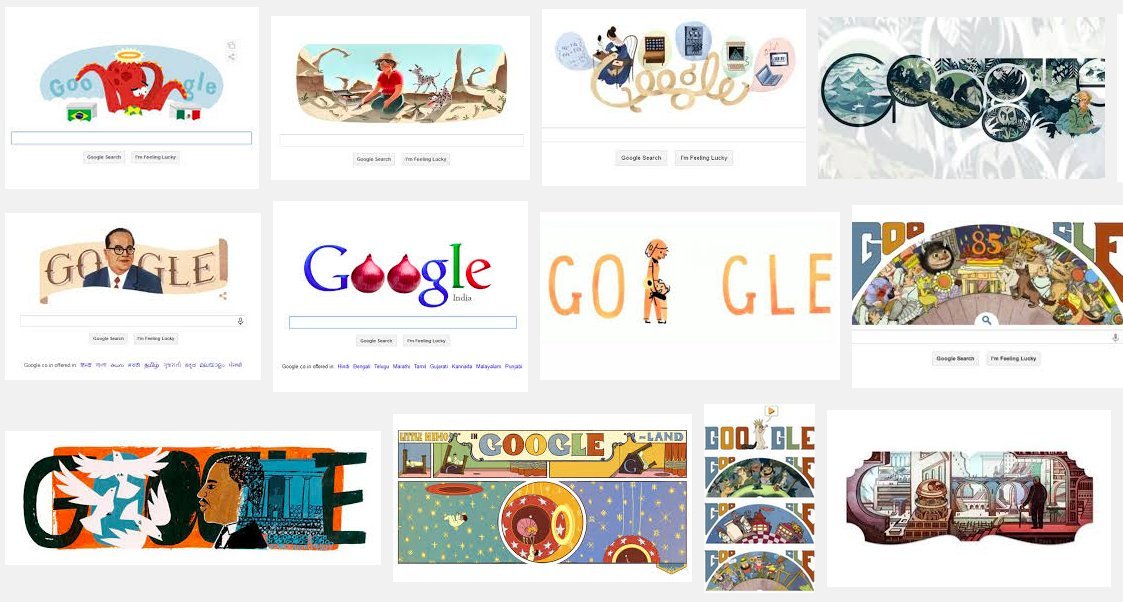
Google often changes its logo to commemorate or pay tribute to a person, a group of people or an event.
But Google has never seen such a drastic change like this. So why now?
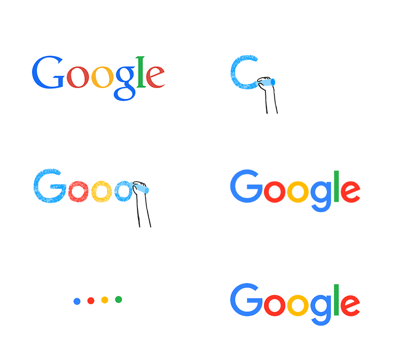
Well, earlier Google was accessed via desktops by people looking for information or answers. But now, people use Google over a wide variety of platforms, apps and devices for a wide variety of reasons. They access Google through mobile phones, TVs, watches, and, yes, sometimes a desktop too.
The initial Google logo was developed for a single desktop browser page. It has now been updated for a world of seamless computing across an endless number of devices and different kinds of inputs such as tap, type and talk.
Google is bidding adieu to the little blue ‘g’ icon and replacing it with a four-color “G” that matches the logo.
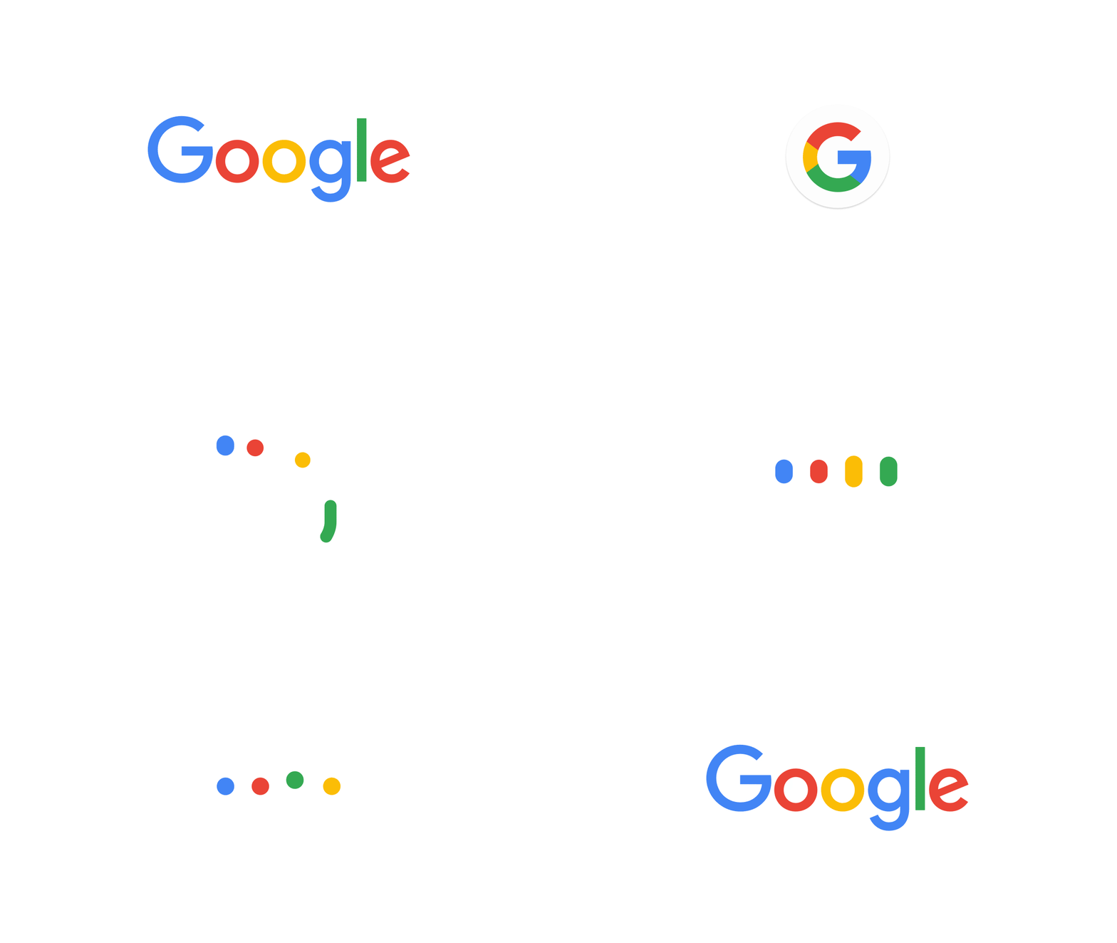
“This isn’t the first time we’ve changed our look and it probably won’t be the last, but we think today’s update is a great reflection of all the ways Google works for you across Search, Maps, Gmail, Chrome and many others,” adds Yehoshua.
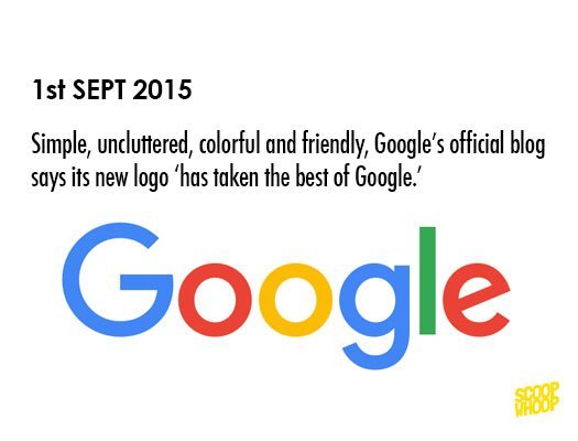
“We think we’ve taken the best of Google (simple, uncluttered, colorful, friendly), and recast it not just for the Google of today, but for the Google of the future.”
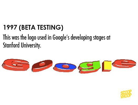
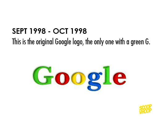
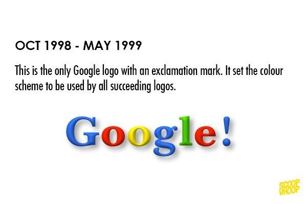
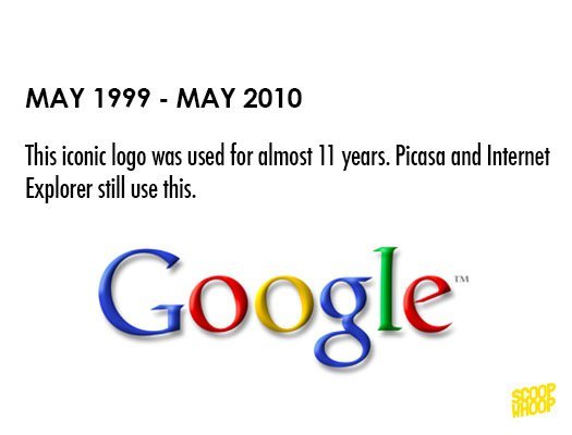
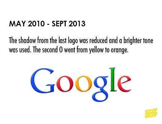
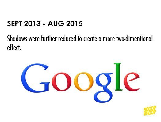
Here’s a chronology of Google logos over the years:
All information sourced from Google.


