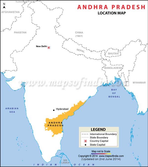
This is the actual outline of Andhra Pradesh in a map of India.
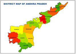
Let’s take a closer look. This is what the outline of the state looks like on its own:
Now let’s take a closer look of the logo specially prepared for the Sunrise Andhra Pradesh Investment Meet 2017, organised at Visakhapatnam from 27th to 28th January 2017.

Since we don’t want to influence your thoughts, here is a quick poll.
What do you think the logo looks like?
1) A random collection of gears
2) The outline of Andhra Pradesh
3) A penis
If your answer is 3, you’re now thinking what many people thought about it.
The slogan, ‘Make Andhra Pradesh Your Business’, only makes it even more cringe-worthy.
This picture was shared by a Reddit user from the event yesterday asking people if the government should re-design the logo. Needless to say, there was some shock and indignation.
“You have ruined it for me forever. I can never look back at the map now without seeing a dong,” said one user.
“Very long. Very thin,” said another.
When ScoopWhoop News contacted R Sivakumar, media-in-charge of the Sunrise Andhra Pradesh Investment Meet, this is what he had to say.
“There are some graphic designers who work for the state government, industries department, they must have worked on it. Or maybe it was outsourced. We have no say on it,” he said.
For now, the Andhra Pradesh will be hoping investors can look beyond the logo and let the state keep their business.