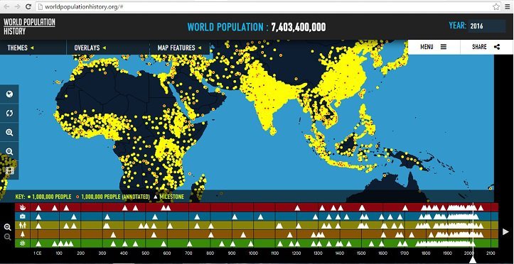
The human population has been growing at an exponential rate for the past two centuries, and it shows no signs of slowing down. It may be difficult to comprehend the massive expansion that still continues, but a video by WorldPopulationHistory.org is attempting to give a clear picture of how the world population will continue to rise till 2050.
The map begins at 1 CE from the Han Dynasty, showing how many people existed about 2,000 years ago. Each yellow dot represents 1 million people in an area. The population of the world stood at 170 million at that point in time.

The map goes through different important phases of human history, such as the Mongol invasion of China and the Black Death era of Europe.
Over a period of 215 years, from 1800 to 2015, world population increased from about 910 million to more than 7.3 billion. The map also shows how this figure will grow to a mammoth 9.6 billion.
The fully interactive map at WorldPopulationHistory.org allows users to go through important milestones in the history by zooming in and out of the map.
Here’s the video:


