


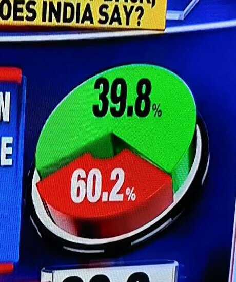
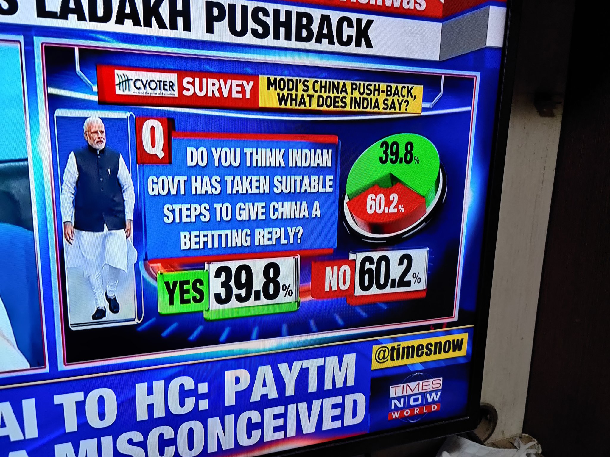
Last night Times Now did a LIVE poll o their channel asking people to vote Yes or Now on if the Modi govt. had taken suitable actions to give a befitting reply to China. Well, as you can imagine, the answer was an overwhelming NO at 60.2%.

Now, Times Now is an indepedent channel by their own admission…

… but Twitter picked up on something. It was the way the infographics on the screen showed the 39.8% YES vote somehow take a bigger piece of the pie chart.
Pie chart died today 😥 #TimesNow pic.twitter.com/Axau2HHDTX
— Mohamed Aafaque (@aafaqtwts) June 24, 2020
Here’s a bit of a closer look for you, because we care.
And since this went on air, it has become a major talking point in today’s liberal banter on Twitter.
Using this trick in my next month's sales presentation to my boss.
— shashank (@Theshashank_p) June 24, 2020
Me to @TimesNow pic.twitter.com/B2IHWwsZZE
— Vishal Mody 🇮🇳 (@modyvishal02) June 24, 2020
Brilliant pie chart!! Matlab hum galat padh ke bade hue😔😔
— punam (@singh_punam) June 25, 2020
Shakha boys doing the pie chart job 🔥
— Nakshatra | নক্ষত্র ❁ (@nmfcb4) June 25, 2020
Use this pie chart to teach your kids the difference between greater and smaller. They will grow up and become successful reporters at #TimesNow pic.twitter.com/yTMz1CtWSK
— Calm A Sutra (@calmdev) June 24, 2020
@TimesNow can I work for you guys
— Amber Bhardwaj (@emberlyhawt) June 24, 2020
Pros of having me:
1) I know how to make a pie chart
Cons of having me :
1) I know how to make a pie chart#TimesNow pic.twitter.com/gdM0MDGUBw
Pie chart of the year 😂😂#Modi #Timesnow @TimesNow pic.twitter.com/p0XF6ScXxB
— Prabagaran SD (@Prabagaran_SD) June 25, 2020
I only feel bad for the person who handles their social media account. I am really sorry, my dude.


