There is an entire science that goes into the making of a company’s logo. The colour, the shape, the size of the fonts, there is a lot it takes to have people flock to you and buy your stuff. Ever wondered why your stomach does a rumble when you look at a McDonald’s? It’s because the colour yellow induces hunger! Ever wondered what Toyota’s brand logo would tell you? There’s a lot of science that went in there too.
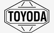
Going by the fine art of logo making, Toyota had to keep in mind what the automobile company stood for, what they offered as a brand and compress all that into a symbol. This is what the old logo of the company looked like.
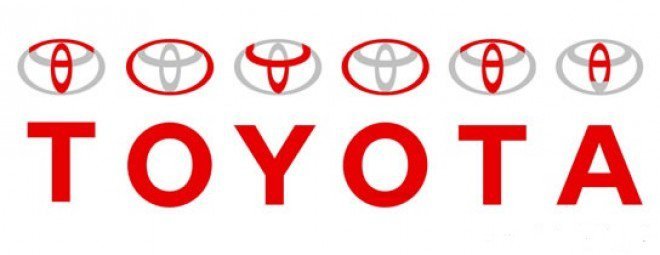
But did you know you could find the name of the brand and everything it stands for in the current logo?
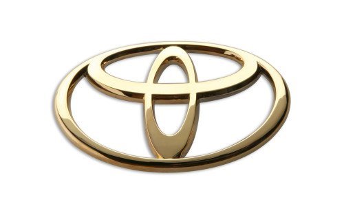
That’s right! What looks like a bunch of ellipses overlapping each other actually carries the alphabets for the name Toyota!
All that, compressed into one small symbol. Well we guess that’s what chota muh, badi baat looks like. That was your gyaan for the day folks! Until next time!