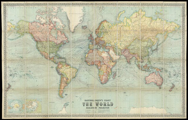
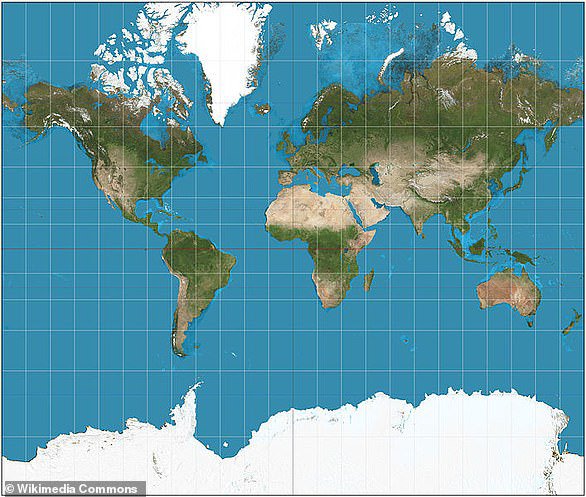
Wondering, how that’s possible? Well, the faded world map that was/is printed in our textbooks is known as the Mercator map. In 1569, this map was created by Gerardus Mercator, who literally built a whole world along the colonial lines.

Now, many may not know this but, the Mercator map had a lot of inconsistencies. For starters, Europe seems larger than North America, but in reality the reverse is true. The equator is not in place.
Also, South America should be twice the size of Europe and Greenland should be 14 times smaller than Africa and three times smaller than Australia. Even Alaska appears thrice as large as Mexico, which should actually be the opposite.

Discovering the Western-centric distorted perception of countries & continents by looking at the Gall-Peters Projection. pic.twitter.com/mhHZZ1qYrK
— Evelyne Auer (@EvelyneAuer) March 21, 2017
This map is known for accurately scaling land according to surface area, creating a far more accurate perception of what the world really looks like.
Watch this video to know more.
Ab aur kya janna baki hai!


